Sell sheets are one of the most underrated tools in a marketer’s toolkit. Whether you’re pitching to retailers, distributors, or end customers, well-designed sell sheets can quickly communicate value, answer key questions, and move people closer to a “yes.” When done right, they act as a silent salesperson—working for your product long after your meeting or email is over.
This guide walks you through exactly how to design high-impact sell sheets that boost product sales, build credibility, and support your broader marketing strategy.
What Is a Sell Sheet (and Why It Matters)?
A sell sheet (also called a sales sheet or one-sheet) is a one-page document that showcases your product or service. Its goal is to:
- Introduce the product
- Highlight key benefits
- Share critical specs or details
- Provide pricing or ordering info (where appropriate)
- Drive a clear next step (order, call, email, visit a site)
Sell sheets are especially powerful in:
- Retail and wholesale pitches
- B2B sales presentations
- Trade shows and events
- Distributor or broker relationships
- Investor or partner meetings
Think of them as the bridge between interest and decision. In one glance, your reader should understand what you sell, who it’s for, and why they should care.
Start With Strategy Before Design
Before you open any design software, define the strategy behind your sell sheets. This keeps your message tight and your layout focused.
1. Clarify the Target Audience
Ask:
- Who will read this? (Retail buyer, procurement manager, end consumer, distributor?)
- What do they care about most? (Margins, shelf appeal, performance, compliance, ease of use?)
- What objections do they typically have?
A grocery buyer cares about case sizes, margins, and shelf velocity. A B2B end user may care more about durability, support, and ROI. Your sell sheet should reflect that.
2. Define One Primary Goal
Every sell sheet should have one main objective, such as:
- Secure a follow-up meeting
- Generate trial orders
- Get added to a retailer’s assortment
- Drive traffic to a landing page or demo
Your copy, visuals, and call-to-action (CTA) should all steer the reader toward this single outcome.
3. Decide the Key Message
If someone remembers just one thing after reading your sell sheet, what should it be?
Examples:
- “This snack delivers premium taste with clean ingredients.”
- “This software cuts your onboarding time in half.”
- “This part reduces downtime and maintenance costs.”
That core message will guide your headline and above-the-fold layout.
Essential Elements of High-Converting Sell Sheets
Great sell sheets tend to share a similar structure. Make sure yours includes these essential elements.
1. A Clear, Benefit-Driven Headline
Your headline should quickly communicate what your product does for the reader.
Weak:
“Acme HR Platform”
Stronger:
“Cut Employee Onboarding Time by 50% with Acme HR”
Use simple, direct language and focus on outcomes, not just features.
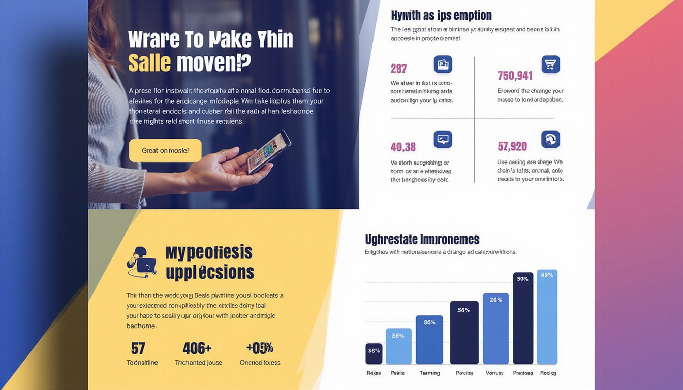
2. Strong Product Imagery
High-quality visuals can make or break your sell sheets, especially in retail.
- Use professional product photos (no blurry or low-res images).
- Show packaging and scale if selling a physical product.
- Include context shots (e.g., the product in use) if space allows.
- Make sure images are large enough to see details, especially on print.
If you have multiple variants (flavors, colors, sizes), feature the hero SKU prominently and add supporting visuals for the rest.
3. Concise, Benefit-Focused Copy
Limit long paragraphs. Use short, skimmable sections:
- A 1–2 sentence product overview
- 3–6 bullet points of key benefits
- Short feature callouts or spec highlights
Always translate features into benefits:
- Feature: “Includes automation workflows.”
- Benefit: “Saves your team hours every week by automating repetitive tasks.”
4. Credibility and Proof
Retail buyers and decision-makers want reassurance that your product performs and will sell.
Consider adding:
- Short customer quotes or testimonials
- Awards or certifications (e.g., organic, ISO, energy ratings)
- Logos of key retailers, clients, or partners
- Data points (e.g., “30% faster,” “20% fewer returns,” “#1 in category growth”)
Just make sure claims can be backed up—credible data builds trust (source: Harvard Business Review).
5. Practical Details They Need to Decide
What details does your reader need to move forward? For sell sheets, this may include:
- Product variants (sizes, colors, flavors)
- SKU numbers or item codes
- Case pack and unit count
- MSRP and wholesale pricing (if appropriate for the audience)
- Dimensions, weight, or technical specifications
- Lead times and minimum order quantities (MOQs)
Make these easy to scan with tables or grouped sections.
6. A Prominent Call-to-Action
Don’t assume they know what to do next.
Include a clear CTA such as:
- “Email us to request samples”
- “Scan to schedule a demo”
- “Place your first order at [website]”
Add your contact information: website, email, phone, and any relevant QR codes or links. Place your CTA both near the top (if room allows) and again near the bottom.
Design Best Practices for Effective Sell Sheets
Once your content is defined, focus on layout and visual hierarchy. Good design helps the reader prioritize what to look at first.
1. Use a Clear Visual Hierarchy
Your reader’s eye should move through the page in this rough order:
- Headline / main image
- Subheadline or short description
- Key benefits
- Product details and proof points
- CTA
Use size, color, and spacing to guide them. Make your headline and hero image dominant; secondary elements should support, not compete.
2. Choose On-Brand Typography
- Stick to 2–3 typefaces maximum.
- Use a large, bold font for the headline.
- Keep body copy clean and easy to read (10–12 pt for print, larger for digital).
- Maintain consistent styles for headings, subheads, and body text.
Avoid decorative fonts in body text; readability is more important than personality.
3. Use Color Strategically
Color should enhance clarity, not overwhelm:
- Use your brand colors consistently.
- Reserve bold or bright colors for headings, CTAs, or key callouts.
- Ensure high contrast between text and background for legibility.
- Leave enough white space so the page doesn’t feel crowded.
If your product packaging uses strong colors, echo them in the design to create visual cohesion.
4. Optimize for Print and Digital
Many sell sheets now live in multiple formats: printed handouts, PDFs, and email attachments.
To ensure flexibility:
- Design at a standard size (e.g., US Letter or A4).
- Keep file sizes manageable for email (optimize images).
- Make sure small text remains readable when printed.
- Avoid elements that only work with interactive PDFs unless you’ll always distribute digitally.
Structuring Content: A Simple Layout Formula
Here’s a straightforward structure you can adapt for most sell sheets:
-
Top Section (Hero)
- Logo
- Headline
- Subheadline (1–2 sentences)
- Hero product image
-
Middle Section (Benefits & Features)
- Short intro paragraph or tagline
- 3–6 bullet-point benefits
- A small “Why it’s different” or “Key features” callout box
-
Side or Lower Section (Proof & Details)
- Small testimonial or stat
- Logos of retailers or clients
- Table of SKUs, sizes, and basic specs
-
Bottom Section (Ordering & CTA)
- Pricing/ordering info (as appropriate)
- Contact details
- Website/QR code and main CTA
This structure keeps information organized and easy to scan, whether your reader spends 10 seconds or 2 minutes with the page.
Common Mistakes to Avoid on Sell Sheets
Even strong products can be held back by poor sell sheet design. Watch out for these pitfalls:
- Too much text: Walls of text are intimidating. Use short paragraphs and bullets.
- No obvious next step: A missing or weak CTA can cost you opportunities.
- Cluttered layout: Overcrowding reduces impact and makes the page harder to skim.
- Low-quality images: Pixelated or poorly lit photos undermine professionalism.
- Jargon-heavy language: Buyers are busy; keep language simple and outcomes-focused.
- Generic messaging: “High quality” is meaningless without specifics. Be concrete.
Aim for clarity over cleverness. If a stranger can’t understand your sell sheet in 15 seconds, keep refining.
Quick Checklist for High-Impact Sell Sheets
Use this list to review your next draft before sending or printing:
- [ ] Headline clearly states a benefit or outcome
- [ ] Product image is clear, high-resolution, and prominent
- [ ] Intro explains what the product is in 1–2 sentences
- [ ] Benefits are listed in bullets and focused on results
- [ ] Features and specs are easy to find and scan
- [ ] Proof elements (testimonials, stats, certifications) are included
- [ ] CTA is visible, specific, and compelling
- [ ] Brand colors, logo, and fonts are consistent
- [ ] Layout has enough white space and a clear hierarchy
- [ ] Contact info and website/QR code are accurate and legible
FAQs About Sell Sheets
1. What should be included in a product sell sheet?
A product sell sheet should include a compelling headline, product overview, strong visuals, key benefits and features, essential specs (sizes, SKUs, case packs), pricing or ordering details when appropriate, proof points (reviews, stats, certifications), and a clear call-to-action with contact information.
2. How long should sales sheets be?
Most sales sheets work best as a single page. The goal is to summarize, not overwhelm. If you have a complex product line, you can create a one-page overview plus separate one-page sell sheets for specific products or categories instead of cramming everything into one.
3. Are digital sell sheets different from printed ones?
Digital sell sheets follow the same principles but need extra attention to file size, readability on screens, and clickable elements like links or buttons. Many companies design one core layout, then export versions optimized for print (high resolution) and for digital use (smaller file size, clickable URLs).
Turn Your Sell Sheets Into Silent Salespower
A well-crafted sell sheet doesn’t just look professional—it clarifies your value, answers objections, and makes it easier for buyers to say yes. By focusing on a clear audience, a single goal, strong visuals, benefit-driven copy, and a prominent call-to-action, you transform a simple one-pager into a powerful sales asset.
If your current sell sheets feel cluttered, unclear, or outdated, now is the time to refresh them. Start with your best-selling or highest-potential products, apply the design principles in this guide, and test your new versions in upcoming pitches and outreach.
Ready to boost conversions and make every sales conversation more effective? Audit your existing sell sheets today, refine them using these tips, and put them to work as the high-impact, revenue-driving tools they’re meant to be.