Retail Signage Secrets to Boost Foot Traffic and Sales
Retail signage plays a far bigger role in your store’s success than most merchants realize. From the moment a shopper walks past your window—or scrolls past your Google listing—your signs are silently selling for you. Done well, they can increase walk-ins, raise average transaction value, and even reduce staff workload by answering common questions.
This guide breaks down practical, proven retail signage tactics you can use today to attract more people into your store and turn browsers into buyers.
Why Retail Signage Still Matters in a Digital-First World
Even in an era of smartphones and social media, in-store and exterior retail signage remains one of the most powerful sales tools you have:
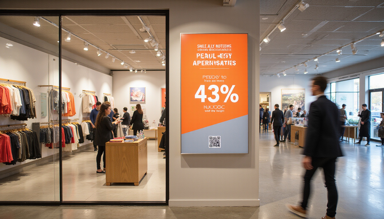
- 80% of shoppers say they’ve entered a store because a sign caught their interest (source: International Sign Association, via ISA).
- Clear, attractive signs help customers navigate, discover products, and understand your value—without needing help from staff.
- Good signage extends your brand, making your store recognizable and memorable in a crowded marketplace.
Think of retail signage as your silent salesperson, brand ambassador, and visual merchandiser all in one. If any of those were underperforming, you’d fix it fast—and your signs deserve the same attention.
The Core Types of Retail Signage (and When to Use Each)
Before diving into “secrets,” it helps to clarify the main categories of in-store and external signs and what they should do.
1. Exterior Storefront Signage
Purpose: Grab attention, create recognition, and communicate “who you are” in seconds.
Key examples:
- Main fascia sign with logo and brand name
- Blade or projecting signs for pedestrians
- Window graphics and decals
- A-frame/sidewalk boards
Best practices:
- Make your brand name and category instantly obvious (e.g., “Harbor & Oak – Home + Gifts”).
- Ensure high contrast and legibility from the distance of passing traffic.
- Keep the message simple: name, what you sell, and one compelling hook if space allows.
2. Window and Street-Level Retail Signage
Purpose: Convert passersby into walk-ins.
Use your windows to:
- Highlight your hero products or most profitable categories
- Promote new arrivals, seasonal collections, or limited-time offers
- Create curiosity (“Only 12 left of our best-selling…”)
Keep text minimal but powerful. A passerby gives you 2–3 seconds tops; you’re not writing an essay, you’re issuing an invitation.
Purpose: Reduce friction and make browsing easy.
Examples:
- Department/category signs (Women, Tech, Home, Kids)
- Directional arrows for key destinations (Fitting Rooms, Checkout, Restrooms)
- Floor decals or hanging signs guiding customers deeper into the store
Good wayfinding:
- Lowers anxiety, especially in large or unfamiliar spaces
- Encourages shoppers to explore more areas, increasing basket size
- Frees staff from answering the same “Where is…?” question all day
4. Informational and Product Education Signs
Purpose: Answer questions, overcome objections, and help shoppers self-serve.
These include:
- Product specification cards
- Comparison charts (e.g., “Good / Better / Best” models)
- Care instructions or usage tips
- Pricing explanations (bundles, subscriptions, memberships)
When shoppers understand value and benefits, they’re more confident—and confidence leads to purchases.
5. Promotional and Point-of-Purchase (POP) Signage
Purpose: Drive action and increase average transaction value.
Situated near:
- End caps
- Checkout counters
- Key displays and “power walls”
Common examples:
- “Buy 2, Get 1 Free”
- “Add Any Accessory for 20% Off”
- “Members Save an Extra 10%”
POP signage is where you turn interest into impulse, and small add-ons into major revenue.
Design Secrets: Make Your Retail Signage Instantly Effective
Strong signs follow a few simple design principles. You don’t need a design degree—just a clear checklist.
Prioritize Readability Over Everything
If people can’t read your sign quickly, nothing else matters.
- Font size: Design for distance. For every 10 feet of viewing distance, aim for at least 1 inch of letter height.
- Font style: Stick to clean, sans-serif fonts for main messages. Save decorative fonts for small accent words.
- Contrast: Dark text on light background or vice versa. Avoid busy, low-contrast color combinations.
Use the “Hierarchy of Information” Rule
Each sign should have:
- Primary message (largest text) – What’s the main point?
- Secondary detail – Short supporting info if needed.
- Tertiary info – Fine print or less-critical details.
For example:
- Primary: “30% OFF ALL DENIM”
- Secondary: “This Weekend Only”
- Tertiary: “Excludes clearance. Discount taken at register.”
Keep the Message Focused
One sign = one idea. Avoid cramming several promos into a single sign. Shoppers scan, they don’t read.
Ask yourself: “If someone sees this for 2 seconds, what do I want them to walk away with?” Then cut everything else.
Align Design with Your Brand
Your retail signage should look like it belongs to your brand:
- Consistent colors from your palette
- Same or similar fonts across signs
- Tone of voice that matches your typical communications (playful, premium, minimalist, etc.)
Consistency builds trust and memorability—critical in competitive retail districts.
Strategic Placement: Turn Foot Traffic into Store Traffic
Even perfectly designed signs fail if they’re in the wrong place. Think like a shopper and use retail signage to guide a journey.
Capture Attention at Three “Zones”
-
Street/Sidewalk Zone
- A-frame boards, banners, and window signs.
- Goal: Stop the scroll of real life—make them pause and look.
-
Threshold Zone (Just Inside the Door)
- Avoid clutter here; it’s a “decompression zone.”
- One clear sign or focal display is enough—welcome them and set expectations (new in, special theme, etc.).
-
Power Walls and Main Aisles
- Use larger, bolder signs to direct traffic to key destinations: “New Arrivals,” “Bestsellers,” “Under $25,” “Sale.”
- Guide people deeper into your store; the longer they stay, the more they spend.
Use Signs to Support Your Layout
Align signage with your merchandising and store design:
- Place category markers above or at the end of aisles.
- Use floor decals or arrows to guide flow during busy seasons.
- Put promotional signs where the purchase decision actually happens (near products, not at random).
Content That Sells: What Your Signs Should Actually Say
Words matter. The language on your retail signage can be the difference between “nice to know” and “must buy now.”
Speak to Benefits, Not Just Features
Instead of:
- “Organic Cotton Sheets”
Try:
- “Sleep Cooler on 100% Organic Cotton Sheets”
Instead of:
- “Noise-Cancelling Headphones”
Try:
- “Block Out the World. Hear Only What You Love.”
Highlight how the product improves the shopper’s life.
Add Urgency and Scarcity (Ethically)
Used sparingly, urgency nudges people to act:
- “Ends Sunday”
- “Limited Run: While Supplies Last”
- “Today Only: Free Gift with Purchase”
Be truthful—manufactured or misleading urgency erodes trust fast.
Use Numbers and Specifics
Specificity feels more credible and compelling:
- “Our #1-Selling Moisturizer – 5,000+ Sold”
- “Save Up to $120 with Bundle Pricing”
- “Last 8 in Stock” (if you update it)
Match Tone to Your Audience
For a playful brand:
- “Your New Favorite Jeans Are in This Direction →”
- “Warning: Extreme Comfiness Ahead”
For a luxury brand:
- “Discover Handcrafted Pieces, Made in Italy”
- “Limited Collection: Designed for the Few”
Measuring the Impact: How to Know Your Retail Signage Works
You can and should track whether signage changes are actually boosting foot traffic and sales.
Simple Ways to Measure
-
Foot Traffic Counters
- Compare walk-ins before and after changing your window or exterior signs.
-
POS Data
- Track sales of products with new signage versus similar items without.
- Monitor average transaction value when you add or refine POP signs.
-
Promo Codes or Phrases
- Use signs with unique codes (“Mention ‘SPRING20’ at checkout”) to see how many sales they drive.
-
Customer Feedback
- Train staff to ask: “How did you hear about this offer?” or “Did you see the sign about…?”
- Adjust based on what customers mention—or don’t.
A/B Test Your Messaging
You don’t have to guess. Test:
- Two headline variants on a window poster (rotate weekly)
- Different CTAs on POP signs (“Add One Today” vs. “Complete the Look”)
- Layouts with more imagery vs. more text
Track which versions correspond with higher conversions.
Digital and Physical: Make Your Signage Work Everywhere
Retail signage doesn’t live only in your store. Extend your most effective messages across channels.
- Use the same key offers on window signs, website banners, and social media posts.
- Include in-store visuals in Google Business Profile photos to set expectations.
- Repurpose design templates for email headers and paid social ads.
When a shopper sees the same clear message in multiple places, it reinforces your value and builds trust.
Common Retail Signage Mistakes to Avoid
Even good retailers fall into some of these traps. Watch for:
- Cluttered windows that overwhelm instead of invite
- Tiny fonts and low contrast that are unreadable from a distance
- Too many promotions at once, causing decision fatigue
- Outdated or incorrect information (expired offers, old pricing)
- Mismatched branding that makes your store look inconsistent or unprofessional
Run a quick signage audit at least every quarter and fix these issues fast.
Quick Retail Signage Checklist
Use this list as a practical starting point the next time you walk your store:
- [ ] Storefront sign is visible and legible from the street
- [ ] Windows highlight 1–2 key offers or themes, not everything
- [ ] Clear welcome or “what’s new” message inside the entrance
- [ ] Obvious wayfinding signs for main categories and destinations
- [ ] Product signage explains benefits, not just features
- [ ] POP signs at checkout and high-traffic displays encourage add-ons
- [ ] Design is on-brand: fonts, colors, tone of voice
- [ ] No outdated, damaged, or handwritten “temporary” signs left up
- [ ] Promotions have clear start/end dates and conditions
- [ ] Key signs tested and updated based on performance data
FAQ About Retail Signage
Q1: What types of retail signage are most effective for increasing foot traffic?
Exterior and window retail signage typically have the biggest impact on foot traffic. Large, legible storefront signs build brand recognition, while focused window messages—promoting new arrivals, seasonal events, or compelling offers—give passersby a reason to step inside right now.
Q2: How often should I update in-store retail signage?
Update promotional and point-of-purchase retail signage whenever offers change or at least monthly. Core branding and wayfinding signs can stay longer, but review them quarterly to ensure they still match your layout, pricing, and brand identity.
Q3: Is digital retail signage better than traditional printed signs?
Digital retail signage offers flexibility—easy updates, motion, and dynamic content—which can be powerful in high-traffic areas or for frequently changing promotions. However, traditional printed signs are cost-effective and still extremely effective when well-designed. Many retailers see the best results by combining both.
Effective retail signage isn’t about being flashy; it’s about being clear, intentional, and aligned with how your customers actually shop. When your signs welcome people from the street, guide them smoothly through your store, answer their questions, and highlight the right offers at the right time, you create a shopping experience that naturally boosts both foot traffic and sales.
If you’re ready to turn your signage into a true sales engine, start with a walk-through of your store today using the checklist above, then prioritize your highest-impact opportunities: your windows, your power walls, and your checkout. From there, test, refine, and build a consistent retail signage system that sells for you every day—whether your team is busy or not.