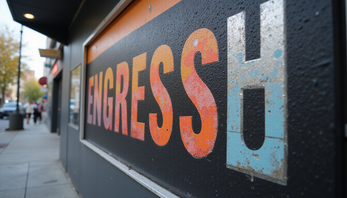
Kiosk Graphics: Boost Brand Visibility with High-Impact Design Tips
Kiosk graphics can turn an ordinary booth, counter, or display into a magnet for attention—if they’re designed well. Whether you’re preparing for a trade show, outfitting a retail kiosk, or setting up an interactive information station, the right visuals can dramatically increase engagement, dwell time, and conversions.
This guide walks you through practical, high-impact design tips for kiosk graphics that not only look great but also deliver measurable branding and business results.
Why Kiosk Graphics Matter More Than Ever
In busy environments—malls, trade shows, airports, campuses—people are bombarded with visual stimuli. Kiosk graphics act as your brand’s “billboard at eye level,” helping you:
- Stand out in a crowded space
- Communicate your offer in seconds
- Guide people to interact with your kiosk (touchscreens, brochures, sign-ups)
- Reinforce brand recognition and trust
Well-designed kiosk graphics can influence whether someone stops or walks by. Given that people form a first impression in as little as 50 milliseconds (source: Nielsen Norman Group), those first visual cues matter.
Start with Strategy: Define the Purpose of Your Kiosk
Before choosing colors, fonts, or images, clarify what your kiosk needs to accomplish. This strategic step prevents clutter and confusion later.
Ask:
-
What is the primary goal?
- Lead capture
- Direct sales
- Product demos
- Wayfinding / information
- Brand awareness
-
Who is the target audience?
- Demographics (age, profession, language)
- Pain points or goals
- Level of familiarity with your brand
-
How will people encounter the kiosk?
- Walking quickly past a corridor
- Standing in line near it
- Approaching it intentionally as a service point
Your answers influence everything from font size and imagery to where you position your key messages on the kiosk graphics.
Design for the Drive-By: Make Your Message Instantly Clear
Most people first see your kiosk from a distance and at a glance. That means your graphics must communicate your core value in 3–5 seconds.
Craft a Clear, Short Headline
Aim for one primary headline that captures what you offer, not everything you do.
- Keep it under 7 words if possible
- Focus on a benefit (“Get Faster Tech Repairs Today”)
- Avoid jargon—speak your audience’s language
Place this headline at the top or in the most visible area of your kiosk graphics, ideally at or slightly above average eye level.
Use a Strong Visual Hierarchy
Visual hierarchy guides the eye in the order you intend:
- Primary headline (biggest, boldest)
- Key visual (image or icon that supports headline)
- Supporting subheading or concise bullet points
- Call-to-action (what to do next: “Tap to Begin,” “Scan to Save 20%”)
Use size, color contrast, and spacing to create this order. If everything is bold and bright, nothing stands out.
Choose Colors That Attract and Align with Your Brand
Color is one of the fastest ways to communicate brand identity and attract attention.
Stick to a Simple Palette
- Use 2–3 primary colors (usually your brand colors)
- Add 1 accent color for calls-to-action or key highlights
- Ensure adequate contrast for readability (dark text on light background or vice versa)
Avoid the temptation to fill your kiosk graphics with every color available. A clean palette looks more professional and is easier on the eyes.
Consider the Environment
Where will your kiosk be placed?
- Bright, noisy trade show floor: Bold, contrasting colors can help you stand out.
- Minimalist retail space: Softer colors or more white space may blend better with the environment while still standing out.
- Outdoor or sunlit area: Higher contrast and UV-stable inks and materials will improve visibility and durability.
Typography That Works from Across the Room
If people can’t read your kiosk graphics from a distance, the design fails—no matter how pretty it is.
Prioritize Legibility Over Style
- Use clean, sans serif fonts for headlines and body text (e.g., Helvetica, Open Sans, Montserrat)
- Limit yourself to two fonts: one for headings, one for supporting text
- Avoid overly decorative or script fonts except for small accent words
Right-Size Your Text
As a rough rule of thumb:
- 1 inch of letter height is readable at about 10 feet
- Headlines should often be 3–6 inches tall depending on viewing distance
- Supporting text should be large enough to read at arm’s length without effort
Test your kiosk graphics on screen by zooming out or printing a small proof and backing away to check readability.
Use Images and Icons with a Clear Purpose
The visuals you choose should clarify, not clutter.
Select High-Impact Imagery
- Use high-resolution photos or illustrations to avoid pixelation at large sizes
- Choose imagery that shows your product or outcome in context (people using it, “before and after” scenarios)
- Avoid generic stock photos that don’t align with your brand or message
Leverage Simple, Recognizable Icons
Icons can quickly convey actions or features:
- “Tap here” icons for touchpoints
- Social media icons near your handles
- Location or map icons for wayfinding kiosks
Keep icon styles consistent across all kiosk graphics for a cohesive look.
Layout Principles for Effective Kiosk Graphics
A strong layout ties everything together and makes information effortless to absorb.
Respect the “3–5 Second Scan” Rule
Design your layout so that someone can understand the core in a few seconds:
- One main headline
- One supporting visual
- One primary call-to-action
Everything else—secondary copy, QR codes, small details—should be visually subordinate and not compete for attention.
Use White Space Generously
White space (empty space) is not “wasted.” It:
- Improves readability
- Highlights important elements
- Makes your kiosk feel modern and premium
If your kiosk graphics feel cramped, remove elements before shrinking everything down.
Optimize Content for On-the-Go Audiences
People engaging with kiosk graphics are often in motion. Your copy needs to account for limited time and attention.
Keep Copy Short and Skimmable
- Replace paragraphs with short phrases or bullets
- Write at a 6th–8th grade reading level for clarity
- Focus on outcomes rather than features
For example, instead of:
“Advanced analytics dashboard providing multi-channel performance insights and robust reporting capabilities.”
Try:
“See all your marketing results in one simple dashboard.”
Include a Clear, Visible Call-to-Action
Every kiosk should answer: What should the visitor do next?
Common CTAs for kiosk graphics:
- “Tap to Get Your Quote”
- “Scan to Unlock Show-Only Deals”
- “Enter to Win a Free Upgrade”
- “Find Your Nearest Store”
Make CTAs visually distinct with an accent color and ample space around them.
Align Physical Graphics with Digital Interactivity
Many modern kiosks combine printed kiosk graphics with digital screens or touchscreen interfaces. These must work together visually and functionally.
Create a Cohesive Visual System
- Match colors, fonts, and icon styles between static graphics and on-screen UI
- Use the same core headline or value prop in both places
- Consider motion on screen as a complement (not a competitor) to printed elements
Guide the User Journey
Use your kiosk graphics to:
- Point clearly to interactive areas (“Start Here,” arrows, framing)
- Explain what will happen: “Tap for a 2-Minute Quiz” or “Check-In for Your Appointment”
- Reduce anxiety with short, reassuring copy: “No email required” or “Takes less than 60 seconds”
Practical Checklist: Kiosk Graphics that Convert
Before finalizing your design, run it through this quick checklist:
-
Goal clarity
- Can a stranger tell your kiosk’s purpose in 5 seconds?
-
Headline impact
- Is your main message clear, short, and benefit-driven?
-
Readability
- Is all key text legible from intended viewing distances?
-
Visual hierarchy
- Is it obvious what to look at first, second, and third?
-
Brand consistency
- Do colors, fonts, and tone match the rest of your brand?
-
Image quality
- Are images and logos high resolution and on-brand?
-
CTA prominence
- Is there a single, obvious next step for users?
-
Environment fit
- Will the design stand out (but not clash) in the actual space?
-
Production-ready files
- Are dimensions, bleed, and resolution set correctly for your printer?
FAQs About Kiosk Graphics and Design
Q1: What size should kiosk graphics be for maximum impact?
There’s no one-size-fits-all, because kiosk dimensions vary. Start with your hardware specs, then ensure key elements—logo, headline, CTA—are placed at typical eye level (around 57–63 inches from the floor) and sized for viewing distances. Work closely with your kiosk or print vendor for recommended dimensions and safe zones.
Q2: How can I make portable kiosk display graphics more effective at trade shows?
For portable kiosks, prioritize simplicity and speed of understanding. Focus on one main offer per side, use bold headlines and clean visuals, and integrate QR codes or short URLs for quick follow-up actions. Design modular elements (like interchangeable panels) so you can update messages for different events without redoing the entire kiosk.
Q3: What are best practices for digital kiosk signage graphics?
For digital kiosk signage, use motion sparingly and ensure each screen can be understood even if someone catches it mid-loop. Maintain high contrast, sufficient font sizes, and short messages. Test your content on the actual hardware when possible to verify color, brightness, and touch-target accuracy.
Turn Your Kiosk into a High-Performing Brand Asset
Kiosk graphics are more than decoration—they’re working assets that can attract, inform, and convert in some of the busiest environments your brand will ever face. By clarifying your goals, simplifying your messages, and designing with context in mind, you can transform a simple kiosk into a powerful, always-on brand ambassador.
If you’re ready to elevate your next kiosk project, now is the time to act. Gather your brand assets, map out your primary message and call-to-action, and collaborate with a design and print or fabrication partner who understands kiosk graphics specifically—not just generic signage. With the right strategy and execution, your kiosk won’t just be seen; it will be remembered, visited, and acted on.