Whether you design business cards, packaging, books, or billboards, mastering print production is what turns a good layout into a polished, professional piece. You can create the most beautiful design on screen, but if colors shift, type looks fuzzy, or elements get cut off in trimming, the final result will disappoint both you and your client. Understanding how print really works puts you back in control—and saves time, money, and stress.
Below are the essential print production secrets every designer should know today, from file setup to press checks.
1. Start every project with the print specs
The biggest print production mistake is designing first and asking questions later. Before you open your design software, clarify:
- Final size (trim size)
- Bleed requirements
- Number of pages or panels
- Paper type and weight
- Printing method (digital, offset, large format, etc.)
- Color process (CMYK, spot/Pantone, or a mix)
- Binding and finishing (folds, scores, die cuts, foiling, varnish)
Designing to a real specification keeps you from last‑minute compromises and rework. Ask your printer for a spec sheet or template. Many printers provide downloadable InDesign or PDF templates with correct bleeds, margins, and panel sizes.
2. Color modes: Why RGB vs CMYK really matters
Screens use RGB light; print uses CMYK ink. If your file stays in RGB until the last moment, you can get ugly surprises on paper.
Work in the right color space from the start
- For anything going to press: work in CMYK.
- For digital-only projects: RGB is fine (and often better).
Set your document color mode correctly in InDesign, Illustrator, or Photoshop when you create the file. Converting an entire RGB design to CMYK at export is where many colors shift or dull.
Soft-proof your colors
Use your design software’s soft-proofing to preview how RGB colors will look in CMYK. In Adobe apps:
- View → Proof Setup → Working CMYK
- Then View → Proof Colors
This shows you which bright RGB hues (like neon blues and electric greens) will lose intensity in print. Adjust your palette while you still have time.
If brand colors are critical, get Pantone or spot color values and work those into your print production files.
3. Resolution and image quality: Avoid pixelation
Low-resolution images are the fastest way to ruin your print job. On screen, 72 PPI can look acceptable. On paper, it will look soft, jagged, or pixelated.
Essential resolution rules
For most print production scenarios:
- 300 PPI at final size for photos and raster artwork
- 600–1200 PPI for line art or 1-bit graphics, like logos saved as bitmap TIFFs
Upscaling a low-res image in Photoshop doesn’t magically add detail. If your client provides small, compressed images, be upfront: the print quality will suffer, or they’ll need to supply better source files.
Always check links in InDesign (Links panel) or the image info in other tools to verify effective resolution at the size you’re actually using in your layout.
4. Bleed, trim, and safe zones: Protect your layout
Anything that extends to the edge of the page must “bleed” beyond the final trim to avoid white slivers after cutting.
Key definitions
- Trim size: The final size of the printed piece after cutting.
- Bleed: Extra image area beyond the trim, cut off in finishing.
- Safe area (margin): Area inside the trim where important content is kept.
Standard bleed and margin guidelines
- Set 3 mm (1/8") bleed on all sides (check your printer—some want 5 mm).
- Place text, logos, and key elements at least 4–6 mm (0.125–0.25") inside the trim.
- Make sure background colors and images extend all the way through the bleed, not just to the trim.
In most layout tools, you can specify bleed when creating the document, and you should include bleed marks when exporting to PDF.
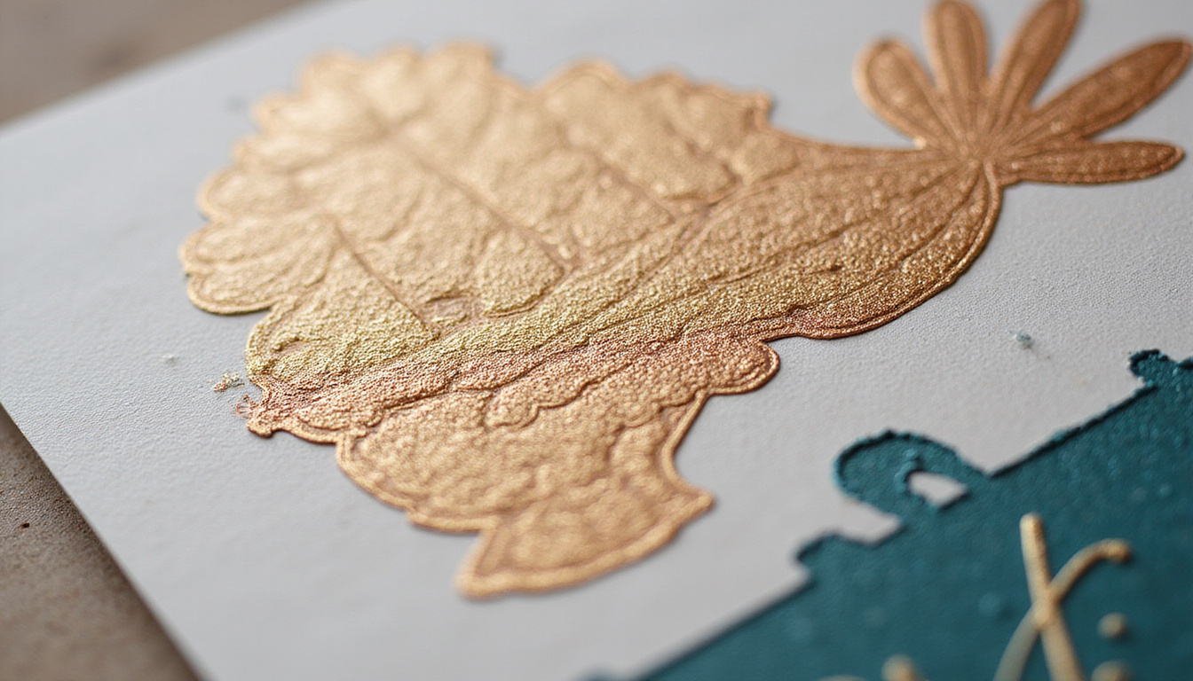
5. Rich black vs. 100% black: Get deep, solid blacks
On press, not all black is equal. Using only 100% K (black ink) can look flat or washed out in large areas.
When to use which black
- Text and fine lines: Use 100% K only (C0 M0 Y0 K100). This avoids misregistration causing fuzzy edges.
- Large black areas or solid backgrounds: Use rich black (a mix of CMY with K) for a deeper, more even black. A common safe formula:
- C60 M40 Y40 K100 (check with your printer for their preference).
Avoid using “Registration” color for any design elements; it’s intended only for crop marks and registration marks.
6. Vector vs raster: Choose the right format
Print production quality often comes down to using vector where you can, and raster only where you must.
-
Use vector (Illustrator, SVG, EPS, native shapes) for:
- Logos
- Icons
- Line art
- Type and simple graphics
-
Use raster (Photoshop, high‑res JPEG/TIFF/PSD) for:
- Photos
- Textured backgrounds
- Complex effects
Vector graphics remain sharp at any size, which is crucial for logos on large format prints like banners or signage. Never embed a logo as a low-res JPEG if you have the vector original available.
7. Typography for print: Crisp, readable, dependable
Typography issues in print production often come down to tiny details that are invisible on screen.
Font handling
- Embed or outline fonts:
- In PDF exports, fonts should be embedded.
- For vector artwork (e.g., Illustrator files) sent directly to printers, convert display type to outlines.
- Avoid using system fonts that may not be licensed or available at the printer; rely on properly licensed fonts.
Legibility and size
Printed type often reads smaller than it looks on screen. As a rough guideline:
- Body text: 9–11 pt for most text-heavy pieces.
- Don’t go below 6 pt for print, especially with thin fonts or reversed text (light text on a dark background).
- Use adequate tracking and leading; tight spacing can fill in or blur when printed.
8. Choosing the right paper and finish
Paper is not just a substrate—it changes how your design looks and feels. Choosing wisely is a core part of print production.
Paper finish
- Coated (gloss/silk/matte):
- Sharper images and more vibrant color
- Great for photos, brochures, magazines
- Uncoated:
- Softer, more tactile and “premium”
- Absorbs more ink; colors can look slightly duller
- Ideal for stationery, books, and minimalist designs
Paper weight
Common weights (US and EU equivalents vary):
- 80–100 gsm: letterhead, flyers
- 130–170 gsm: posters, high-end flyers
- 200–300+ gsm: postcards, business cards, covers
Ask your printer for a paper dummy—a mock-up using the actual stock and weight—to feel thickness and see how folds or binding will behave.
9. Digital vs offset: How the method changes your design
Understanding how your piece will be produced helps you design and prepare files properly.
Digital printing
- Best for short runs and quick turnarounds
- Cost-effective for small quantities
- Good for variable data (personalized prints)
- Color can vary slightly run-to-run
Offset printing
- Best for larger runs (often 500–1,000+)
- Higher setup cost, but lower cost per unit at scale
- Extremely consistent color once dialed in
- More flexibility with spot colors, coatings, and special finishes
If color fidelity and special inks (metallic, fluorescent, Pantone) are critical, offset is usually the right choice. Talk to your printer before promising specific finishes to your client.
A solid technical introduction to printing processes is available from organizations like the Print & Graphics Scholarship Foundation (PGSF) and industry resources such as Printing.org (source).
10. Preflight: Catching errors before they cost you
Preflighting your files is the print production equivalent of proofreading—skip it and you invite expensive mistakes.
Run through this checklist before sending final files:
- Document size, bleeds, and margins match the printer’s specs.
- All images are linked (not missing) and at proper resolution.
- Color spaces are correct (no unintended RGB or spot colors).
- Black usage is correct (100% K for small text; rich black where needed).
- Fonts are embedded or converted to outlines, as appropriate.
- Overprint/knockout settings checked (especially for white objects—white should rarely ever be set to overprint).
- Page order and imposition (if handled by you) are correct.
- Printer’s marks and bleeds are included in the exported PDF, if required.
Most layout software (InDesign, for example) has a built-in Preflight panel to flag common issues automatically.
11. Communicating with your printer like a pro
The “secret” many designers miss: your printer is a collaborator, not just a vendor. Strong communication dramatically improves print production outcomes.
Share with your printer:
- Final size and any special folds/die cuts
- Color expectations (e.g., match brand Pantones)
- Samples or photos of the look you’re aiming for
- Concerns: small type, tight registration, heavy ink coverage
Ask for:
- A print-ready template if they have one
- A recommended PDF preset
- Advice on suitable papers and finishes within your budget
- A hard proof or calibrated digital proof for critical work
The more detail you give, the more likely your final piece will align with your vision.
12. Proofs and press checks: Your last line of defense
Never skip proofreading and checking a proof—this is where you catch the issues that survived all your earlier checks.
Types of proofs
- Digital soft proof (PDF):
- Quick and cheap, good for layout and content
- Not color-accurate unless you’re using a managed workflow
- Digital hard proof:
- Printed proof simulating final color and stock
- Ideal when color is critical
- Press check:
- You (or your rep) visit the press as it’s printing
- Approve color and quality on the actual run
When reviewing proofs:
- Check spelling, alignment, and bleeds.
- Compare colors to any brand guides or previous printed pieces.
- Review small type, reversed text, and fine lines closely.
One missed typo or color error on a 5,000-piece run is a painful, avoidable mistake.
Quick print production checklist for designers
Before you hit “send to printer,” run through this short list:
- [ ] Designed to correct final size with proper bleed and safe margins
- [ ] Images at 300 PPI (or higher where needed) at final size
- [ ] All colors in CMYK or correctly defined spot/Pantone as required
- [ ] Blacks set correctly (100K text, rich black for solids)
- [ ] Fonts embedded or converted to outlines
- [ ] Links updated; no missing images or low-res placeholders
- [ ] Overprint settings checked, especially for white elements
- [ ] Correct PDF export preset used (e.g., PDF/X standard recommended by printer)
- [ ] Proof carefully reviewed and approved
Keep this checklist handy and refine it based on feedback from your printer over time.
FAQ: Common questions about print production
1. What is print production in graphic design?
Print production is the process of taking a finished design and preparing, proofing, and manufacturing it as a physical piece—whether that’s a brochure, poster, package, or book. It includes file setup, color management, preflighting, choosing paper and printing method, and overseeing the final output.
2. How do I prepare files for professional printing?
To prepare files for professional printing, work in CMYK, set correct bleeds and margins, use 300 PPI images, manage black correctly (single vs rich black), embed or outline fonts, and export to a print-ready PDF using the settings your printer recommends. Always run a preflight check and review a proof before approving the final print production run.
3. Which format is best for print-ready artwork?
For most printers, a high-quality PDF/X file is the preferred format for print ready artwork. It preserves fonts, images, colors, and vector information in a predictable way. Native files (InDesign, Illustrator) are sometimes accepted, but a properly exported print production PDF is generally faster, safer, and more consistent.
Mastering print production is what transforms you from “someone who designs” into a designer clients trust with important, high-stakes projects. When you control color, type, paper, and print methods, your work looks intentional and premium—and you avoid costly reprints and last-minute panic.
If you’re ready to sharpen your print production skills, start by standardizing your own checklist, building relationships with one or two reliable printers, and testing your designs with small, real-world print runs. Turn your next project into a case study in flawless print—and use that to win bigger, better work.