Envelope Design Hacks That Skyrocket Open Rates and Brand Appeal
If you’re still treating envelope design as an afterthought, you’re leaving money, attention, and brand equity on the table. In a marketing world crowded with emails and notifications, a smartly designed envelope can cut through the noise, get opened faster, and make your brand feel premium and memorable.
Below are practical, testable envelope design hacks that can dramatically improve open rates and boost your brand appeal—without blowing up your budget.
Why Envelope Design Matters More Than You Think
Before anyone reads what’s inside, they judge your message by its container. Envelope design is your first handshake: it signals importance, credibility, and curiosity.
A well-designed envelope can:
- Increase open rates for direct mail campaigns
- Strengthen brand recognition and trust
- Improve perceived value of what’s inside
- Turn a routine bill or statement into a brand touchpoint
As digital channels get saturated, direct mail is performing surprisingly well. The Data & Marketing Association has consistently reported higher response rates for direct mail than for most digital ads, especially when it’s highly targeted and well designed (source: ANA/DMA Response Rate Report).
Hack #1: Start With Clear Objectives (Then Design Backwards)
Before you touch colors or fonts, decide what this envelope must achieve.
Ask:
- Is the primary goal to be opened quickly?
- Do you want it to look official, personal, premium, or playful?
- Is it for an existing customer or a cold prospect?
- Is discretion important (e.g., medical, financial, legal)?
Your objective dictates the style of envelope design:
- Urgent/transactional: Bolder, clearer messaging, maybe “Time-sensitive” language.
- Premium/brand-building: Minimalist design, high-quality stock, subtle branding.
- Personal/relationship-driven: Handwritten fonts, stamps, smaller sizes, softer colors.
Design backwards from the desired reaction: “This looks important,” “This looks interesting,” or “This looks like it’s for me.”
Hack #2: Use Size and Shape to Break the Pattern
Most mail is a standard #10 white business envelope. That predictability is your opportunity.
Consider:
- Non-standard sizes (within postal regulations): A slightly shorter or squarer envelope stands out in a stack.
- Landscape orientation: Rotate your envelope so the long side opens at the top; it feels more like an invitation.
- Slim or mini envelopes: Great for event invites, personal notes, and special promotions.
Tip: Always check postal rules and pricing. Oversized or irregular shapes can increase postage—but that extra attention might be worth it for high-value campaigns.
Hack #3: Color Psychology That Gets Envelopes Opened
Color is one of the fastest ways to stand out. Thoughtful envelope design uses color purposefully, not randomly.
Strategic approaches:
-
Branded but not blinding
Use your brand colors, but avoid full-bleed neon that screams “junk mail.” Try a colored border, colored flap, or tinted paper instead. -
Use contrast to frame key elements
High contrast between envelope color and text improves readability and impact. -
Color signals for tone
- Blue, navy, gray: trustworthy, professional (good for finance, B2B, healthcare).
- Earth tones, kraft: natural, artisanal, eco-conscious (great for lifestyle brands).
- Red, orange, yellow: urgency, energy (best used in moderation, like badges or stamps).
If you can’t afford fully colored envelopes, use colored ink, a bold accent stripe, or a stand-out return address block to inject personality.
Hack #4: Leverage the “Tease vs. Mystery” Balance on the Front
You’re always balancing two competing goals:
- Make it look worth opening
- Avoid looking like hard-sell junk mail
Smart envelope design uses just enough information to make people curious—without giving everything away.
Tactics that work:
-
Intriguing teaser copy
- “You’re closer than you think…”
- “Open to see your personalized blueprint.”
- “A thank-you we’ve been meaning to send.”
-
Value-focused hints
- “Includes a free sample inside.”
- “Details of your member benefits enclosed.”
- “Important information about your coverage.”
-
Relevant visuals
A small icon that hints at content (e.g., a house for insurance quotes; a calendar for event invitations).
Avoid over-hype (“You’ve WON!!!”) unless it fits a specific, on-brand promotion. Overly aggressive language screams “marketing” and can backfire.
Hack #5: Make It Look Personal—Even at Scale
People open what looks like it was sent by a person, not a machine. Modern digital print tech makes “personal” envelope design scalable.
Ways to personalize:
-
Real or realistic handwriting
- Handwritten-style fonts for the address or note.
- A short, handwritten-looking phrase on the front: “From Sarah in Support” or “Thought you’d like this.”
-
Actual stamps vs. indicia
Physical stamps (especially commemorative ones) feel more personal than printed postage. For high-value segments, it can be worth the extra effort. -
Variable data printing (VDP)
Include the recipient’s first name or city in your teaser copy:- “Maria, your 2025 savings estimate is inside.”
- “For homeowners in Austin: important updates enclosed.”
Combine these techniques and your “mass mailing” starts to feel like one-to-one communication.
Hack #6: Turn the Back Flap Into Story Space
Most marketers ignore the back of the envelope. That’s a missed opportunity.
Use the back flap area to:
-
Reinforce credibility:
“Rated 4.8/5 by over 10,000 customers.” -
Explain the benefit of opening:
“Inside: a 3-step plan to cut your energy bill by 20%.” -
Add brand character:
A short tagline or micro-story:
“We started this company because your monthly bill shouldn’t come with a headache.” -
Reduce anxiety:
“This is not a sales contract—just information to help you decide.”
People often flip an envelope before deciding to open or toss. Make that flip count.
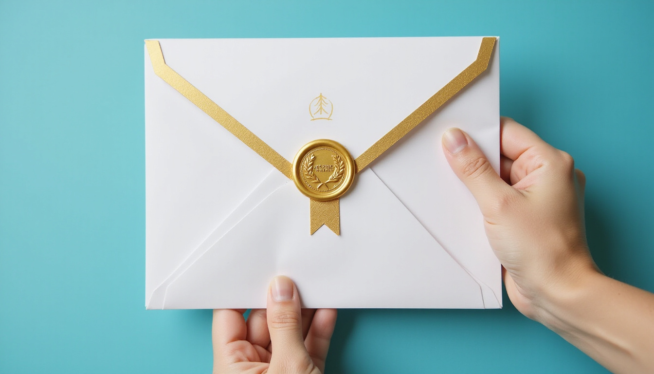
Hack #7: Align Paper Stock With Your Brand Positioning
The feel of your envelope design speaks before anyone reads a word.
Consider:
-
Paper weight
Heavier stock feels premium and important. Lighter feels cheaper but can be appropriate for everyday statements. -
Texture
- Smooth, satin finishes = modern, professional.
- Textured, uncoated = artisanal, eco-friendly, crafted.
-
Color of stock
Off-white, cream, or kraft paper can feel warmer and more tactile than bright white—particularly for lifestyle, hospitality, and boutique brands.
If your brand is positioned as high-end or detail-oriented, cheap-feeling envelopes create a credibility gap.
Hack #8: Use Windows and Transparency Strategically
Window envelopes can showcase something compelling inside instead of a generic address.
Ideas:
- Position a bold headline or offer to show through the window.
- Show a membership card, event ticket, or colorful insert.
- Use a non-standard window shape (circle or vertical slit) for added interest.
Alternatively, consider semi-transparent vellum envelopes for special campaigns. A hint of color or graphics from the insert can tease what’s inside while maintaining intrigue.
Hack #9: Optimize Layout for Instant Readability
Even great copy fails if it’s hard to process at a glance. Apply basic layout rules:
- Hierarchy: One obvious focal point (key message), one secondary, everything else subdued.
- Whitespace: Don’t cram every surface. Breathing room looks classy and intentional.
- Font choices:
- Use 1–2 fonts max.
- Ensure address fields are ultra-legible (postal machines are unforgiving).
- Avoid super-thin or ultra-fancy scripts for critical information.
Design your envelope as if someone will give it half a second of attention. What do they notice? What do they feel?
Hack #10: Incorporate Subtle, On-Brand Visuals
Your envelope design should reflect your brand without overwhelming the recipient.
Options include:
- A small logo in an unexpected spot (e.g., on the flap).
- A faint pattern or watermark background tied to your visual identity.
- A single on-brand illustration or icon that hints at your product or mission.
- Minimalist line art or shapes instead of full photos to keep printing costs lower.
The goal: unmistakably “you,” but still clean and inviting.
Hack #11: Test, Don’t Guess—Use Simple A/B Experiments
The best envelope design is proven, not just pretty. You don’t need massive volume to run useful tests.
Things to A/B test:
- Envelope color (white vs. brand color vs. kraft)
- Teaser copy (none vs. benefit-led vs. curiosity-led)
- Personalization (generic vs. first-name callout)
- Postage style (indicia vs. stamps for small segments)
- Window vs. no window
Keep everything else constant so you isolate the impact of one design variable. Track:
- Open rate (where measurable via codes or follow-up behavior)
- Response rate (visits, calls, purchases)
- Cost per response or per acquisition
Even small boosts compound over multiple mailings.
Hack #12: Match the Inside Experience to the Promise
A brilliant envelope design that leads to a boring or confusing interior kills trust. The moment of opening should be satisfying:
- Ensure your main envelope message connects directly to the headline on the first page or insert.
- Make key information easy to find within a few seconds.
- Keep the tone consistent—don’t be playful on the outside and stiff on the inside (or vice versa).
Think of the whole experience as a story: the envelope is the hook, the content is the payoff.
Quick Checklist: High-Impact Elements of Strong Envelope Design
Use this checklist before you go to print:
- Does the envelope clearly reflect my objective (open fast, feel premium, etc.)?
- Does the size/shape stand out appropriately for my audience and budget?
- Is the color scheme aligned with my brand and message tone?
- Is there a single strong focal point on the front (headline, visual, or both)?
- Does it look personal or human in at least one way (handwriting, stamp, name)?
- Is the back flap space used strategically for story, trust, or value?
- Does the paper stock feel aligned with my brand’s positioning?
- Is it machine-readable and compliant with postal rules?
- Have I planned at least one variable to A/B test?
- Does the inside content truly deliver on what the envelope promises?
If you can tick most of these, you’re already ahead of the pack.
FAQs About Envelope Design and Direct Mail
Q1: What makes an envelope design most likely to be opened?
Envelopes are opened more often when they look personal, relevant, and non-gimmicky. Elements like a realistic handwritten font, real stamps, a clear benefit statement, and a non-standard but postal-friendly size all increase the odds. Avoid over-the-top claims and visual clutter that resemble mass junk mail.
Q2: How can I create a professional business envelope design on a budget?
Focus on a few high-impact, low-cost tactics: use a clean layout, a single brand color accent, a clear value-based teaser line, and a high-contrast, legible font. You can print on standard white stock and still look polished by adding a simple border, logo placement, and thoughtful back-flap copy without investing in specialty papers.
Q3: Are branded envelopes better than plain ones for conversions?
Generally yes—when done subtly. A well-executed branded envelope design builds recognition and trust, particularly with existing customers. That said, for some campaigns (e.g., highly sensitive topics or certain cold-mail offers), plainer, more “personal” envelopes may outperform heavily branded ones. Testing both is the best way to know for your audience.
Turn Your Next Envelope Into a High-Performing Marketing Asset
Every mailing you send is already paying for design, printing, and postage. Optimizing your envelope design is one of the simplest ways to squeeze much more return out of that same spend. When you treat the envelope as a strategic brand and conversion tool—not just packaging—you boost open rates, deepen brand perception, and set up everything inside to perform better.
If you’re planning your next campaign or updating your stationery, now is the ideal time to rethink your envelopes. Audit what you’re currently sending, apply a few of these hacks, and run a small A/B test. With just a couple of smart design changes, you can transform a forgettable piece of mail into a powerful, attention-grabbing brand experience.