Smartly designed menu boards can quietly become your highest-performing “salesperson.” Whether you run a café, food truck, fast-casual restaurant, bar, or quick-service concept, your menu board shapes what people order, how much they spend, and how fast they decide. When you combine layout, pricing psychology, and strategic placement, your menu can add dollars to every ticket—without feeling pushy.
This guide breaks down tested tactics to design, price, and position menu boards that actually move the needle on sales and profit.
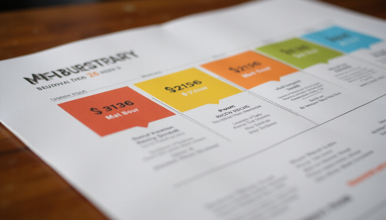
Why Menu Boards Matter More Than You Think
Menu boards don’t just list items—they guide decisions. Guests are often:
- In a hurry
- Unsure what to order
- Influenced by visual cues more than they realize
Studies in restaurant psychology show that strategic menu design can increase sales of featured items by 10–15% or more (source: Cornell University School of Hotel Administration). Multiply that across hundreds or thousands of transactions, and the impact is huge.
The right menu board can:
- Shorten ordering time
- Increase average check size
- Quietly steer guests toward high-margin items
- Reduce “decision fatigue” and order anxiety
The Psychology Behind High-Performing Menu Boards
Before you move pieces around on a board, understand how people actually read menus.
The “Scan Path”: How Eyes Move Across a Board
People don’t read menu boards top-to-bottom like a book. They usually:
- Look at the center or upper center first
- Scan top right / top left
- Then move to lower sections
Use this knowledge to:
- Put your most profitable or signature items in these “hot zones”
- Place combos and bundles where the eye lands first
- Avoid cluttering prime space with low-margin fillers
Choice Architecture: Less Is Often More
Too many choices cause decision paralysis. If your menu board is overloaded:
- Guests take longer
- More people default to the cheapest/safest option
- Lines slow down
Whenever possible:
- Group items into clear categories
- Limit visible choices per category (5–7 is often enough)
- Hide “everything we can do” on handheld menus or a QR menu; keep the board focused
Designing Menu Boards That Drive Orders (Not Confusion)
1. Clarify Your Categories
Organize your menu boards so customers instantly know “where to look for what.”
Common, clear categories:
- Burgers / Sandwiches
- Bowls / Salads
- Sides
- Drinks
- Combos / Meal Deals
- Add-ons / Extras
Use headers that are:
- Large enough to spot from several feet away
- Visually distinct (color, font weight, or background)
Customers should be able to say within two seconds: “That’s where I’ll find what I want.”
2. Use Hierarchy: Not Everything Is Equal
Text hierarchy tells guests what matters most:
- Largest text: Category headers and your hero items
- Medium text: Item names
- Smaller text: Descriptions
- Smallest text: Prices (but still readable)
A simple rule: If everything is bold and bright, nothing stands out. Build a deliberate hierarchy so the eyes are always drawn to what you want to sell more of.
3. Descriptions That Sell Without Being Wordy
Short descriptions sell better than bare item names—but only if they’re specific.
Weak:
- “Chicken Sandwich”
Better:
- “Crispy Chicken Sandwich – buttermilk fried chicken, pickles, spicy mayo on a toasted brioche bun”
Guidelines:
- 5–12 words per description is usually enough
- Highlight sensory and quality cues: crispy, slow-roasted, house-made, hand-cut
- Avoid vague buzzwords like “tasty,” “delicious,” “amazing”
Visual Tactics: Colors, Photos, and Icons That Boost Sales
Use Color With Intention
Colors influence mood and appetite:
- Red/Orange: Stimulate appetite and urgency—great for callouts, limited-time offers
- Yellow: Grabs attention—good for price bubbles or combos
- Green: Signals freshness, health, and quality
- Dark tones: Can make your board look premium when paired with clear, bright text
Don’t turn your menu boards into a rainbow. Pick 2–3 primary colors and stick to them for a cohesive brand look.
Photos: When to Use Them (and When Not To)
Photos can dramatically increase item sales—but only if they’re good and used sparingly.
Best practices:
- Use high-quality, well-lit, realistic photos
- Limit to a few key items (e.g., 3–8 images total)
- Avoid stock photos that don’t match the real item
- Don’t place a photo next to every item; it clutters and cheapens the board
Feature photos for:
- Signature or new items
- High-margin products
- Combos and upgrades (e.g., “Make it a meal” visual)
Icons and Symbols That Guide Buying
Simple icons can quickly guide choices:
- 🌶️ or a small pepper symbol for spicy items
- Leaf icon for vegetarian/vegan
- Star or badge for “Best Seller” or “Staff Favorite”
- Combo or value icons to highlight deals
The goal: guests decode the menu faster, and you steer them silently.
Pricing Tricks: How to Present Prices Without Undercutting Value
Pricing on menu boards isn’t just math; it’s perception. The way you display prices affects what people choose.
Drop the Currency Symbols (When Appropriate)
Studies show that removing currency symbols (like “$”) can reduce the feeling of spending and encourage higher average checks.
Compare:
- $12.99
- 12.99
If your audience and local norms allow it, test removing the symbol and keeping a clean column of numbers.
Avoid Price Alignment That Encourages Comparison
If every price is perfectly aligned in a neat column, customers run straight down the numbers to find the cheapest option.
Instead:
- Keep prices close to item names, not in a far-right column
- Slightly stagger prices so the eye doesn’t just “price shop”
- Use similar price ranges within a category to reduce friction
Use Strategic Price Anchoring
Price anchoring makes mid-priced items feel more reasonable:
- Include a high-priced premium item (e.g., giant platter, special steak, loaded combo)
- Place it near your target item (the one you want more people to order)
Guests will subconsciously compare: the mid-priced option suddenly feels like a good deal.
Bundle and Upsell With Combos
Combos and bundles are where menu boards can quietly add dollars to each order.
Effective combos:
- Offer clear savings vs. buying items separately
- Are visually highlighted (boxes, different background, badges)
- Use simple language: “Add fries + drink for 4” or “Make it a meal”
Experiment with:
- Small upcharges (“Add cheese for 1,” “Upgrade to large for 0.75”)
- Tiered combos (regular combo vs. premium combo)
Placement: Where to Put Menu Boards for Maximum Impact
Even the best-designed menu boards fail if customers can’t see or process them in time.
Think Line-of-Sight, Not Just Wall Space
Place boards where guests will naturally look before they reach the register.
Key principles:
- Visible from outside or as soon as they enter, if possible
- High enough to clear heads, but not so high that details are hard to read
- Not blocked by hanging fixtures, decor, or point-of-sale displays
Match Menu Complexity to Queue Length
If you have long lines:
- Use a pre-menu board (or “teaser board”) BEFORE the main board showing the most popular or basic choices
- This shortens decision time at the counter
For fast-moving quick-service spots:
- Keep the primary board simple and focused on the most-ordered items
- Use secondary surfaces (table tents, posters) for niche items
Separate Main Menu from Add-Ons
Clustering everything in one dense area overwhelms guests. Instead:
- Use the main menu board for core meals
- Use smaller side boards or panels for:
- Drinks
- Desserts
- Add-ons and extras
- Limited-time offers
This structure keeps ordering smooth while still surfacing profitable extras.
Digital vs. Static Menu Boards: Which Is Better?
Both static and digital menu boards can skyrocket sales when used right.
Benefits of Digital Menu Boards
- Easy to update pricing and items in real time
- Rotate content (breakfast/lunch/dinner; weekday vs. weekend)
- Animate or spotlight high-margin, limited-time, or time-sensitive items
- Adapt to dayparting—morning vs. evening menus automatically
Digital boards are excellent for:
- Fast-casual and QSR concepts
- Multi-location brands needing controlled consistency
- Menus that change often (seasonal, market-driven)
When Static Menu Boards Still Win
Static boards work well when:
- Your menu rarely changes
- Budget is a concern
- You want a cozy, low-tech, or traditional vibe
Chalkboards, printed panels, and backlit static boards can still be incredibly effective if they follow the design, pricing, and placement principles above.
Common Menu Board Mistakes That Kill Sales
Avoid these profit-draining pitfalls:
- Overcrowding: Too many items, tiny fonts, packed margins
- Tiny text: Not legible from where people actually stand
- No hierarchy: Every item looks the same, nothing stands out
- Inconsistent pricing styles: A mix of formats (9.5, 9.50, 9.49) looks sloppy
- Poor lighting: Beautiful boards that are too dim to read
- Out-of-date content: Items “sold out” daily or obviously incorrect prices
Review your menu boards regularly from a customer’s perspective: stand in line, look up, and note what feels confusing or frustrating.
Quick Checklist: Make Your Menu Boards Sell More
Use this simple checklist as you review or redesign your boards:
- Are your most profitable items placed in visual “hot zones”?
- Is there clear category separation and hierarchy?
- Can guests read item names and prices from where they line up?
- Are photos limited, high-quality, and strategically chosen?
- Do prices avoid drawing too much attention (no cluttered price columns)?
- Are combos and add-ons clearly promoted and easy to understand?
- Is the overall board uncluttered, with enough white space?
- Does the board fit your brand (fonts, colors, tone)?
- Is it easy to update when menu or pricing changes?
- Can a first-time guest decide in under 30–40 seconds?
FAQ: Optimizing Menu Boards for Your Business
Q1: How do I design restaurant menu boards that increase sales?
Start by identifying your highest-margin and most popular items, then give them priority placement (center or top sections) and visual emphasis (larger fonts, boxes, or icons). Keep categories clear, limit the number of visible items per section, and use simple, vivid descriptions. Then, layer in bundles and add-ons to increase the average check.
Q2: Are digital menu boards worth it for small businesses?
Digital menu boards can be very effective even for small operations if your menu or prices change frequently, or if you serve different menus by daypart. They reduce printing costs, let you test new layouts and promotions quickly, and can highlight time-limited specials. For a very stable, simple menu, well-designed static boards might be more cost-effective.
Q3: What are best practices for fast food menu boards?
For fast food and quick service, prioritize speed and clarity. Use large, legible text, show clear combo meals, and promote “best sellers” to help guests decide quickly. Pre-menu boards in the drive-thru or before the main ordering point help reduce bottlenecks. Visuals for combos and upgrades are especially powerful for fast food menu boards.
Turn Your Menu Boards Into a Profit Engine
Your menu boards are already talking to your guests—every single day. The question is whether they’re convincing people to spend more, try your signature items, and come back…or quietly pushing them toward the cheapest, fastest option.
By applying the design, pricing, and placement strategies in this guide, you can:
- Simplify decisions for your customers
- Showcase what makes your food special
- Increase average check size and item mix profitability
If you’re ready to transform your menu boards from “just information” into a powerful sales tool, start with one change this week: refine your hero items, redesign a single category, or test a new combo layout. Then measure the impact and iterate.
Need help mapping out a new menu board strategy—item mix, pricing, visuals, and layout? Now is the ideal time to upgrade. Treat your menu boards like the revenue-driving asset they are, and they’ll pay you back every day your doors are open.