
Color Management Hacks to Make Your Prints Match Your Screen
If you’ve ever sent a gorgeous image to print and gotten back something dull, dark, or strangely tinted, you’ve run into a color management problem. The good news: you don’t need a full color science degree to fix it. With a few practical hacks and habits, you can get your prints much closer to what you see on your screen—consistently.
This guide walks you through the essential color management steps photographers, designers, and illustrators use to tame color and avoid expensive, disappointing misprints.
Why Your Prints Don’t Match Your Screen
Before we jump into fixes, it helps to know what’s going wrong.
Screens vs. paper: different worlds
- Screens are emissive: Your monitor creates light (RGB—red, green, blue).
- Prints are reflective: Paper reflects ambient light from ink (CMYK—cyan, magenta, yellow, black).
Because they use different color models and technologies, they can never match 100% perfectly. But with good color management, you can get them very close.
Three big reasons for color mismatch
- Uncalibrated displays: Factory settings are usually too bright and too saturated. Your images look better than they really are.
- Wrong or missing profiles: No consistent color space (sRGB, Adobe RGB, etc.) across your workflow can lead to unpredictable results.
- Printer and paper behavior: Every printer + paper + ink combo has its own color response. Ignoring that means guesswork.
The rest of this article focuses on aligning these three areas so your screen and print speak the same color language.
Hack 1: Calibrate and Profile Your Monitor (The Foundation)
If you do only one color management task, make it this.
Why calibration matters
Most screens out of the box are:
- Too bright
- Too cool (blue-tinted)
- Too contrasty
So you brighten shadows and pump saturation to look good on-screen, then prints come out dark and muddy. Calibration corrects your screen to a known, neutral reference, so your editing decisions are trustworthy.
How to calibrate your display
Best method (recommended): use a hardware calibrator
Devices like the X-Rite i1Display or Datacolor Spyder:
- Attach to your screen.
- Run their software.
- They show a series of colors and measure how your monitor displays them.
- They create and install a monitor ICC profile to correct deviations.
Recommended target settings for photo/design work:
- White point: D65 (6500K)
- Brightness: 80–120 cd/m² (lower than most people expect)
- Gamma: 2.2
- Color space: Native or wide-gamut if you have such a display
If you can’t use hardware (interim hack):
- Manually reduce brightness to where white areas on screen look similar to white paper held nearby under good light.
- Use your OS’s built-in calibration tool for basic gamma and color balance.
- Understand this is a stopgap; hardware calibration is far more reliable.
Recalibrate every 4–8 weeks, or more often if doing color-critical work.
Hack 2: Standardize Your Color Space from Camera to Print
A consistent color space is central to effective color management.
Pick the right color space for your needs
Common working spaces:
- sRGB
- Smallest gamut
- Safest for web, social media, general print labs
- Adobe RGB (1998)
- Wider gamut, especially greens and cyans
- Good for serious photography and high-quality printing
- ProPhoto RGB
- Very large gamut, includes colors no display can show
- Best used for 16-bit editing only to avoid banding
For most users working with labs and the web, sRGB is the safest choice. For fine-art printing and advanced workflows, Adobe RGB can offer better color in print if handled correctly.
Make your workflow color-consistent
- Camera settings (for JPEGs)
- Set color space to sRGB or Adobe RGB to match your workflow.
- RAW files
- The in-camera setting doesn’t bake in, but influences previews. Choose your working space when you process RAW in Lightroom, Capture One, etc.
- Editing software
- In Photoshop:
- Edit → Color Settings → Working Space (choose sRGB or Adobe RGB).
- Set Color Management Policies to “Preserve Embedded Profiles” and enable warning prompts.
- In Lightroom/other apps: check export and soft-proofing profiles.
- In Photoshop:
- Export settings
- For online sharing: export as sRGB.
- For printing: follow your lab’s instructions; many prefer sRGB, some accept Adobe RGB.
Hack 3: Use Printer ICC Profiles and Soft Proofing
This is where color management really starts to make prints align with your screen.
What is a printer ICC profile?
A printer ICC profile is a file that describes how a specific printer + paper + ink combo reproduces color. With it, your software can:
- Predict how colors will shift.
- Compensate to get the closest possible match.
Many labs and paper manufacturers provide free profiles for their products. You can also have custom profiles made for your exact printer/paper setup.
Where to get profiles
- Photo labs: Download ICC profiles directly from their website.
- Paper makers (e.g., Hahnemühle, Canson, Epson, Ilford): Provide profiles per printer model.
- Manufacturers and standards information: See organizations like the International Color Consortium (ICC) for background and best practices (icc color.org – source).
Install the profiles following your OS and software instructions (usually by right-clicking “Install” or placing in a dedicated profiles folder).
Soft proofing: preview print behavior on-screen
Soft proofing lets you simulate how your image will look when printed:
- In Photoshop:
- View → Proof Setup → Custom…
- Choose your printer/paper ICC profile in “Device to Simulate.”
- Select “Relative Colorimetric” or “Perceptual” intent (more on that in the next section).
- Enable “Black Point Compensation” and “Simulate Paper Color” (if helpful).
- In Lightroom Classic:
- Go to the Develop module.
- Enable Soft Proofing.
- Choose your printer/paper profile.
Now you’ll see shifts in saturation, contrast, and color that will likely appear in the actual print, and you can fine-tune accordingly.
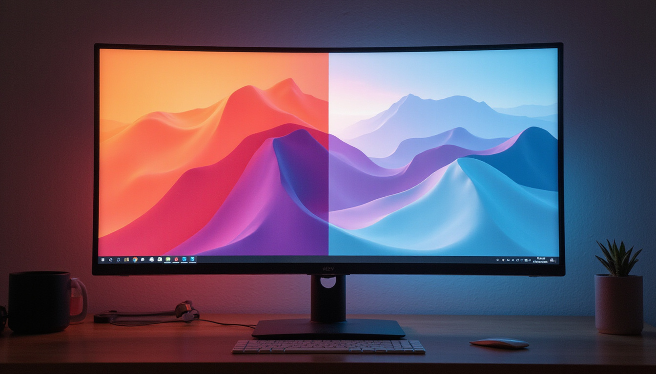
Hack 4: Choose the Right Rendering Intent
When colors in your image fall outside what the printer can reproduce (out of gamut), your software needs a strategy to handle them. That’s where rendering intents come in.
The two most useful for photography and design:
- Perceptual
- Compresses the whole color gamut to fit within the printer’s range.
- Preserves relationships between colors, often better for images with lots of saturated color (landscapes, vibrant graphics).
- Relative Colorimetric
- Maps in-gamut colors exactly, clips out-of-gamut colors to the nearest reproducible tone.
- Maintains more accurate neutrals and overall tonality; good for portraits and many general images.
Use soft proofing and toggle between Perceptual and Relative Colorimetric to see which gives the better visual result for a given image.
Hack 5: Control Your Viewing Conditions
Even perfect color management falls apart if your viewing environment is wildly inconsistent.
Light affects print perception
Prints look different under:
- Warm incandescent bulbs (yellowish).
- Cool daylight or daylight-balanced LEDs.
- Store/gallery lighting.
Aim for:
- Neutral, daylight-balanced lighting (around 5000–6500K) when judging prints.
- A consistent environment—avoid mixing strong warm and cool light.
Tame your workspace
- Avoid strong color casts: No brightly colored walls or strong color light sources near your monitor.
- Reduce glare: Position your monitor to avoid reflections.
- Dim but not dark: A moderately dim room helps your screen and prints feel more comparable, especially if your display brightness is properly lowered.
Hack 6: Prepare Files Correctly for Your Printer or Lab
A great file, prepared properly, makes it vastly easier to get matching prints.
Checklist before sending to print
Use this quick list as a sanity check:
- Color space
- Convert to the lab’s requested profile (often sRGB or specific ICC profile).
- Resolution
- 240–300 ppi at final print size is ideal for most photo prints.
- Sharpening
- Apply output sharpening appropriate to paper type (a bit more for matte than for glossy).
- No double color management
- If printing at home:
- Let either the printer driver or the application (Photoshop/Lightroom) manage color—not both.
- If app manages color, disable color adjustment in the printer driver settings.
- If printing at home:
- Test small
- For critical jobs or new papers, make small proof prints before committing to large or expensive prints.
Hack 7: Use Test Prints and Compare Smartly
Perfect screen–print matching is an iterative process.
Build your own reference
- Print a test image that includes:
- Skin tones
- Neutral grays
- Saturated colors
- Shadows and highlights
- Compare this test print to the on-screen version in your calibrated setup, under neutral light.
- Note patterns:
- Everything too dark? Lower monitor brightness or adjust your tone curve.
- Colors skewing warm or cool? Check paper profiling and white balance.
- Shadows blocked up? Lift shadows slightly in your edits for print.
Over time, you get a feel for how your specific workflow translates to paper and can preemptively adjust.
Summary: Key Color Management Habits
To pull all this together, here’s a simple habit list:
- Calibrate and profile your monitor regularly.
- Choose and stick to one working color space.
- Use proper printer/paper ICC profiles and soft proof.
- Test both Perceptual and Relative Colorimetric intents.
- Evaluate prints under consistent, neutral lighting.
- Prepare files with correct color space, resolution, and sharpening.
- Use test prints to fine-tune your process.
FAQ: Color Management and Matching Prints to Screen
Q1: What is color management in printing, in simple terms?
Color management is the system that keeps colors consistent as they move between devices—camera, monitor, and printer. It uses calibrated hardware, ICC profiles, and defined color spaces so that what you see on your screen closely matches what you get in print.
Q2: How do I set up color management in Photoshop for printing?
In Photoshop, go to Edit → Color Settings and choose a working space (often sRGB or Adobe RGB) and enable profile preservation. For printing, use File → Print, set “Photoshop Manages Colors,” choose your printer/paper ICC profile, pick a rendering intent (Perceptual or Relative Colorimetric), and turn off color adjustments in the printer driver so you don’t double-manage color.
Q3: Do I need a hardware device for monitor color management, or can I do it by eye?
You can make rough adjustments by eye, but for reliable results, a hardware calibrator is strongly recommended. It measures your display objectively and creates a precise ICC profile, which is the foundation of accurate screen-to-print color matching.
Consistent, accurate color isn’t magic—it’s a system. Put these color management hacks into practice, run a few test prints, and you’ll quickly see your screen and prints start to agree. If you’re ready to level up your print quality, start by calibrating your monitor and downloading the right ICC profiles for your printer or lab today—your next batch of prints will thank you.