In a digital-first world, it’s easy to overlook the power of a well-designed piece of paper. Yet smart letterhead printing remains one of the quickest ways to make your business look instantly more professional, credible, and established. Whether you’re sending proposals, contracts, invoices, or welcome letters, your letterhead silently communicates your brand’s quality and attention to detail before a single line of text is read.
This guide walks you through practical strategies for designing, printing, and using letterhead so your business stands out—for the right reasons.
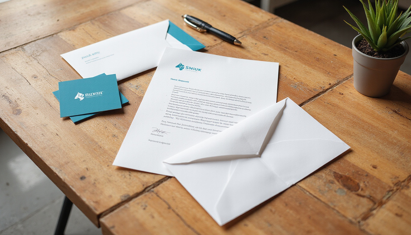
Why Letterhead Still Matters in a Digital Age
Even if most of your communication happens via email, a professionally printed letterhead serves several key purposes:
- Instant credibility: Clients and partners subconsciously associate printed materials with stability and legitimacy.
- Brand consistency: Letterhead reinforces your logo, colors, and messaging across all official documents.
- Legal and formal recognition: Signed agreements, notices, and official correspondence still carry more weight on branded stationery.
- Memorability: A thoughtful design is more likely to be noticed and remembered than a plain, generic page.
Think of letterhead printing as part of your broader brand system—just as important as your website, business cards, or email signatures.
Core Elements of a Professional Letterhead
Before talking print techniques and paper, get the basics right. A strong letterhead balances design, clarity, and function. At minimum, your letterhead should include:
- Company name and logo – Typically in the top header area.
- Tagline or brief descriptor – Optional, but helpful for clarity if your name is abstract.
- Contact information – Phone, email, website, and main address.
- Legal details – Registration numbers, VAT/Tax ID, required disclaimers, depending on your jurisdiction and industry.
Place these elements so they guide the reader’s eye naturally: usually logo and name at the top, contact info in the top corner or footer, with ample white space around them.
Design Strategies for Standout Letterhead
Thoughtful design is what separates forgettable stationery from a piece that elevates every message you send.
1. Prioritize Readability and White Space
Your letterhead should enhance your content, not compete with it.
- Keep the body area clear and uncluttered.
- Avoid large graphics or watermarks that interfere with text.
- Use generous margins so documents look neat when printed, scanned, or copied.
A good rule: if your logo or design elements make it hard to read black text in a standard font, simplify.
2. Choose Fonts That Reflect Your Brand
Font choices for letterhead printing should be clean, legible, and aligned with your brand personality.
- Serif fonts (e.g., Garamond, Georgia) convey tradition and formality.
- Sans-serif fonts (e.g., Helvetica, Lato) feel modern and minimal.
- Use no more than two font families—one for your logo/heading and one for body text.
Ensure your body font prints clearly at 10–12 pt size. Fancy script fonts should be limited to logos or small accents, not the main contact info.
3. Use Color Strategically
Full-color letterhead can look excellent, but only when color is used with restraint.
- Tie colors directly to your existing brand palette.
- Use one dominant color and one accent color at most.
- Ensure sufficient contrast between text and background for legibility.
- Consider how colors will appear on different printers and scanners—avoid very light tints for important information.
If budget is tight, a one-color design using your primary brand color can still look polished and premium.
4. Decide on Layout: Top-Heavy, Bottom-Heavy, or Side-Column
Most traditional layouts place the logo and key information at the top, but you have options:
- Top header layout: Classic and versatile; works for most businesses.
- Footer-focused layout: Clean top area with branding and details in the bottom margin.
- Side-bar layout: Vertical band on the left or right edge with logo and color blocks.
Whichever you choose, test-print a draft to ensure your regular document templates (letters, proposals, invoices) still look balanced.
Paper Choices That Influence Perception
Letterhead printing is as much about feel as it is about look. The paper you choose communicates a lot about your brand.
1. Weight and Thickness
Standard office paper is usually 70–80 gsm (grams per square meter). For letterhead, consider stepping up:
- 90–100 gsm: A solid upgrade that feels more substantial than typical copy paper.
- 100–120 gsm: Feels premium and professional, ideal for client-facing documents.
- Above 120 gsm: Heavier, more like cover stock—good for special letters or certificates.
Heavier paper feels more luxurious and resists show-through (important if you print double-sided).
2. Finish and Texture
Common finishes for letterhead printing include:
- Uncoated: Natural, easy to write on with any pen or pencil; best for everyday use.
- Matte: Smooth and refined; colors print nicely without glare.
- Laid or textured: Adds tactile interest and a traditional, high-end feel.
- Recycled stock: Conveys environmental responsibility, often slightly off-white.
For documents that will be signed or annotated, uncoated or lightly textured stock is usually the safest choice.
3. Color: Bright White vs. Off-White
- Bright white: Crisp, modern, and ideal for high-contrast logos and text.
- Cream or off-white: Softer, more traditional, often used by law firms, consultancies, or luxury brands.
Select a paper color that harmonizes with your logo—some brand colors look better on warmer, slightly off-white stocks.
Printing Methods: Digital vs. Offset
Choosing the right printing method impacts both cost and quality.
Digital Printing
Best for:
- Short runs or frequent small batches.
- Businesses that frequently update details (addresses, phone numbers, branding).
- Quick turnaround times.
Benefits:
- Lower setup costs.
- Easy personalization and variable data.
- Good quality for most standard designs.
Offset Printing
Best for:
- Larger runs where per-unit cost matters.
- Designs with large solid color areas or special inks.
- High-end or color-critical branding.
Benefits:
- Superior color consistency and sharpness.
- More options for specialty inks (metallic, Pantone spot colors).
- Typically more economical at higher quantities.
A print professional can help you decide which method suits your current volume and quality needs (source: Printing Industries of America).
Advanced Letterhead Printing Enhancements
If you want your stationery to feel truly premium, consider subtle specialty finishes. Use them sparingly so they stay elegant, not flashy.
- Embossing or debossing: Raises or indents the logo or name for a tactile effect.
- Foil stamping: Adds metallic accents (gold, silver, copper) to key elements.
- Spot UV coating: Glossy highlight on portions of the design against a matte background.
- Die-cut shapes or edges: Custom cutouts or unique corners for highly distinctive stationery.
These techniques cost more, so they’re best for businesses aiming at luxury markets or high-value B2B relationships.
Practical Tips for Everyday Use
Gorgeous letterhead is wasted if it’s hard to work with. Make sure it fits smoothly into your daily operations.
Create Matching Digital Templates
Even if your primary focus is printed letterhead, you’ll often send documents as PDFs or email attachments. Ensure consistency by:
- Creating Word, Google Docs, or InDesign templates using your letterhead design.
- Matching margins, fonts, and colors to your printed version.
- Exporting as PDF so layout doesn’t shift on different devices.
Allow for Printer Margins
Home and office printers often can’t print edge-to-edge. When designing for letterhead printing:
- Keep important content at least 0.25–0.5 inches (6–12 mm) away from the page edge.
- Ask your print provider if they’ll pre-print the letterhead and you’ll add text later, or if you’ll print everything in one pass in-house.
Plan for Multi-Page Documents
Most multi-page letters use the printed letterhead only on the first page, with subsequent pages on blank or lightly branded paper.
Options for additional pages:
- Use plain paper to save cost.
- Add a small logo or page footer using your office printer.
- Order “second sheets” with simpler, low-ink branding.
Cost-Saving Strategies Without Sacrificing Quality
You don’t have to overspend to look professional.
- Order in sensible quantities: Larger runs reduce per-sheet cost, but only order what you’ll realistically use before details change.
- Use one or two colors: A simple, clean design can look more premium than an overcomplicated full-color layout.
- Standard sizes only: Stick with standard A4 or US Letter to avoid custom-cut charges.
- Skip heavy coverage: Large color blocks increase ink usage and can cause curl; lighter designs are usually more economical and practical.
Talk with your print shop about price breaks at specific quantities—they can often suggest minor tweaks that save money while preserving the look.
How to Brief Your Designer or Print Shop
A clear brief helps you get results faster and with fewer revisions. When starting a letterhead printing project, be ready to provide:
- Your logo files (vector format preferred: .AI, .EPS, or high-res PDF).
- Brand colors (CMYK and Pantone codes if available).
- Preferred fonts or brand type guidelines.
- Required legal text or disclaimers.
- Typical use cases (e.g., contracts, international mail, formal letters).
- Whether pages will be double-sided or single-sided.
- Your target budget and approximate quantity.
The more context you share, the easier it is for professionals to recommend appropriate paper stock, printing method, and finishes.
FAQ: Common Questions About Letterhead Printing
1. What size should I use for business letterhead?
Most businesses use standard document sizes for printed business letterhead:
- A4 (210 x 297 mm) in most of the world.
- US Letter (8.5" x 11") in the United States and Canada.
Sticking to standard sizes ensures compatibility with printers, envelopes, and document templates.
2. How do I design professional letterhead for small business use?
For small business letterhead printing, focus on clarity and brand basics:
- Include logo, business name, and key contact details.
- Use one clean, legible font for body text.
- Choose a slightly heavier paper than regular copy stock.
- Keep the design simple so you can print black text over it without issues.
If your budget is limited, prioritize a good logo and solid layout over fancy finishes.
3. Should my letterhead printing match my other branded materials?
Yes. Custom letterhead printing should be part of a cohesive visual identity. Use the same:
- Logo
- Color palette
- Core fonts
- Tone of design (minimal, bold, traditional, etc.)
Consistent branding across letterhead, business cards, proposals, and your website reinforces recognition and trust.
Make Your First Impression Count
Every document you send is a branding opportunity. Well-planned letterhead printing turns ordinary paperwork into a subtle but powerful signal of professionalism, stability, and care. By choosing thoughtful design, appropriate paper, and the right printing method, you ensure that every proposal, contract, and client letter supports your brand instead of undermining it.
If your current stationery looks dated, generic, or DIY, this is the perfect time to upgrade. Partner with a reputable designer or print provider, refine your visual identity, and invest in letterhead that reflects the quality of your work. The next time a prospect opens an envelope from your company, your letterhead will speak volumes before they read a single word—encouraging them to trust, remember, and do business with you.