In a world dominated by digital screens, small format printing still has huge power to grab attention, drive foot traffic, and close sales—especially when it comes to posters. Whether you’re promoting an event, a retail offer, or a new product, the right small poster can stop people in their tracks and move them to act.
This guide walks you through practical, proven hacks to design, print, and use small-format posters that don’t just look good—they actually sell.
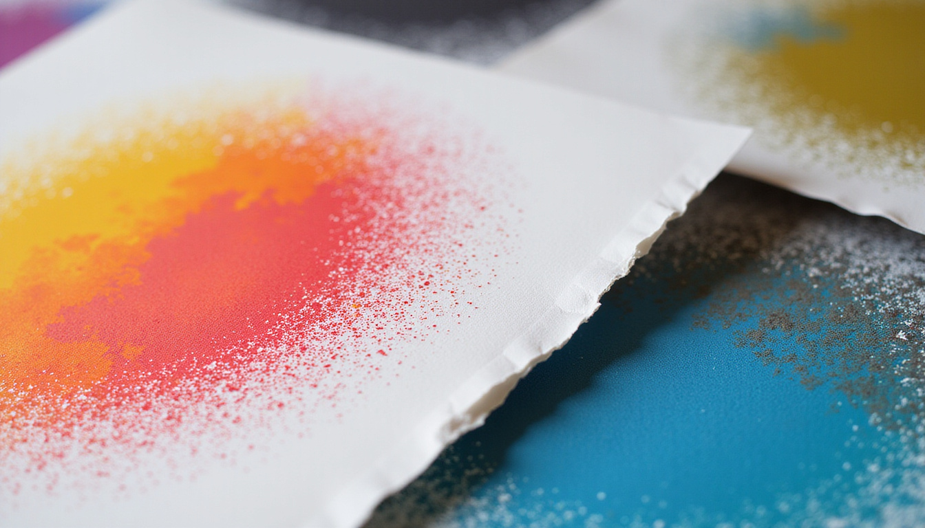
What is small format printing (and why it sells)
Small format printing typically covers printed materials up to about 13" x 19" (e.g., A3, tabloid, letter, legal). For posters, that includes popular sizes like:
- 8.5" x 11" (letter)
- 11" x 17" (tabloid)
- A4 and A3
These sizes are inexpensive, fast to produce, and incredibly versatile. When used strategically, they become mini billboards for:
- Retail promotions
- Café and restaurant specials
- Event announcements
- Product launches
- Local services
The key advantage: small posters can be everywhere—on doors, counters, checkout lines, community boards, windows—reaching people close to the point of purchase or decision.
Start with a selling objective, not a design
Before opening your design software, answer one question: what specific action do you want people to take?
Your objective might be:
- Visit your website or landing page
- Scan a QR code for a discount
- Come to a specific event
- Ask about a product or service
- Follow a social media account
Once you know the single action you want, build everything around it:
- Headline: focused on the benefit that leads to that action
- Visual: supports and amplifies that benefit
- Call to action (CTA): crystal clear, visible, and compelling
If your poster tries to do everything, it will end up doing nothing.
Design hacks for small format posters that stand out
1. Use the “three-second rule”
Assume a passerby gives your poster three seconds of attention. In that tiny window, they should understand:
- What it’s about
- Why it matters to them
- What to do next
To pass the three-second test:
- Make your headline large and simple (ideally 3–7 words).
- Use one main image or graphic, not a collage.
- Keep secondary text brief and scannable: short lines, bullet points, or bold key phrases.
If a stranger can’t explain your poster after a quick glance, simplify it.
2. Prioritize hierarchy: what the eyes see first
In small format printing, every square inch matters. Use visual hierarchy so the viewer’s eye moves the way you want:
- 1st level: Headline – biggest, boldest, most contrast.
- 2nd level: Main visual or offer – product image, event photo, or large price/discount.
- 3rd level: Supporting details – date, time, location, features.
- 4th level: Call to action – QR code, URL, phone, “Ask at the counter.”
A practical trick: squint at your design or zoom out to 25%. If the hierarchy is clear at a glance, you’re on the right track.
3. Choose colors that pop in your environment
Your poster doesn’t live in a vacuum—it lives on a wall, in a window, on a bulletin board. Design so it stands out from its surroundings.
- In a neutral environment (beige walls, wood, glass), bright accent colors (red, orange, teal) grab attention.
- In a visually noisy space (other posters, signage), use strong contrast: dark background with bright text or vice versa.
- Limit your palette to 2–3 main colors plus black/white for clarity.
When using CMYK for small format printing, ask your printer for a color profile or proof so your on-screen colors won’t disappoint on paper.
4. Pick fonts for clarity and character
Your type choices directly affect how “premium” or “cheap” your poster feels—and how readable it is from a distance.
Guidelines:
- Use no more than two typefaces (e.g., one for headings, one for body).
- Choose a clean, sans-serif for headlines and main messages.
- For longer text, use a font that’s highly readable at small sizes (10–12 pt).
- Avoid overly decorative fonts for anything important; use them sparingly as accents.
A simple, tested combo:
- Headline: Bold sans-serif (e.g., Montserrat, Open Sans)
- Body: Regular sans-serif or humanist serif (e.g., Lora, Source Serif)
Content hacks: write copy that actually sells
5. Lead with a benefit, not the brand
People don’t care about your logo first—they care about what’s in it for them.
Instead of:
- “XYZ Gym” in huge letters
Try:
- “Feel Stronger in 30 Days” as the headline
and the logo smaller but visible.
Transform your headline into a clear benefit or outcome:
- “Sell Out Your Event”
- “Cut Your Energy Bill by 20%”
- “Fresh Coffee. Faster Mornings.”
Your brand still matters, but let the benefit open the door.
6. Use the “so what?” test on every line
For every piece of copy on your small poster, ask: so what?
Example:
- “New menu launched.” → So what?
- “New menu: 2-for-1 burgers after 8 PM.” → Clear value.
Make each statement specific and outcome-focused. Being concise increases impact.
7. Make your call-to-action impossible to miss
In small format printing, a strong CTA can double or triple response rates because people see your poster close to the decision point.
Tips:
- Use action verbs: “Scan for 10% off,” “Book your free consult,” “Visit today.”
- Place the CTA in a high-contrast box or band.
- Repeat it twice: once near the middle and again at the bottom.
- Pair with a QR code for instant response on mobile.
Technical printing hacks for sharper, more professional posters
8. Set up files correctly for small format printing
Get the basics right to avoid blurry or cut-off prints:
- Resolution: 300 dpi at final print size.
- Color mode: CMYK for professional printers.
- Bleed: Typically 0.125" (3 mm) on all sides if colors or images go to the edge.
- Safe area: Keep important text/logos at least 0.25" (6 mm) from the edge.
Most professional printing companies provide templates; use them to avoid layout surprises.
9. Match paper stock to the job
Paper choice can make a small poster feel premium and durable—or flimsy and forgettable.
Consider:
- Glossy stock: Best for photo-heavy, vibrant designs. Great for indoor retail and events.
- Matte or satin: Better for text-heavy posters, reduces glare in bright lighting.
- Heavier weight (e.g., 100–130 lb cover / 200–300 gsm): Feels substantial, resists curling.
- Synthetic or laminated: For moisture-prone areas (bathrooms, kitchens, outdoor boards).
Talk to your print provider about typical use; they can recommend optimal stocks (source: Printing Industries of America).
10. Use finishes strategically, not everywhere
Premium finishes can make your small format printing look high-end without massive cost:
- Spot UV: Highlight key elements like your logo or offer.
- Foil accents: Great for luxury products or special events.
- Soft-touch laminate: Creates a velvety, upscale feel.
Use them sparingly on the elements that matter most—like the headline or main offer—so they attract the eye rather than overwhelm it.
Placement and distribution hacks that multiply your impact
11. Place posters where decisions are made
Well-designed small format printing can fail if it’s in the wrong place. Focus on decision zones:
- Near checkouts and payment counters
- On restroom doors and mirrors
- At entrances and exits
- On product shelves or display end-caps
- Inside fitting rooms
- At waiting areas and queues
Ask: “Where is my customer when they’re most likely to say yes?” Put your posters there.
12. Use repetition and variation
One poster is a whisper. Several posters become a conversation.
- Repeat the same core visual and headline across multiple locations.
- Use slight variations for context:
- At the entrance: awareness (“Big Weekend Sale”)
- Near the product: urgency and details (“Sale Ends Sunday – Aisle 4”)
Repeated exposure increases recall and response.
Optimization hacks: test and measure what actually sells
13. A/B test your small format posters
You don’t have to guess which design performs best. Test it.
Create two versions that differ in only one key element, such as:
- Headline
- Main image
- Offer (“10% off” vs. “$10 off”)
- CTA (“Scan to save” vs. “Claim your free trial”)
Then:
- Place each version in similar locations.
- Track responses with unique QR codes, URLs, or offer codes.
- Run the test long enough to see a clear winner, then roll that version out wider.
14. Track metrics that matter
Choose at least one measurable outcome:
- Number of QR code scans
- New email sign-ups
- Coupon redemptions
- Landing page visits
- In-store mentions (“I saw the poster”)
Use these numbers to refine future designs and offers instead of relying on gut feeling.
Practical checklist for profitable small-format posters
Before you send any poster to print, run through this quick checklist:
- [ ] Single clear objective
- [ ] Benefit-driven headline
- [ ] Simple, high-impact visual
- [ ] Clear hierarchy (headline → visual/offer → details → CTA)
- [ ] Readable fonts and sizes
- [ ] Strong, context-aware colors and contrast
- [ ] Concise, outcome-focused copy
- [ ] Obvious, repeated call-to-action
- [ ] Proper print setup (CMYK, 300 dpi, bleed, safe area)
- [ ] Appropriate paper stock and finish
- [ ] Strategic placement plan
- [ ] Simple tracking method (QR, URL, code)
FAQ: small format printing for posters
Q1: What sizes work best for small format poster printing?
Common and effective sizes for small format printing include 8.5" x 11", 11" x 17", A4, and A3. The “best” size depends on viewing distance and available space—11" x 17" is a strong all-round choice for retail and events.
Q2: Is digital or offset better for small format printing posters?
For short runs and frequent design changes, digital printing is usually best—faster and more cost-effective. For higher volumes with consistent artwork, offset printing can offer better unit costs and very consistent color.
Q3: What file format should I use for professional small format printing?
Most printers prefer print-ready PDF with embedded fonts, CMYK color, 300 dpi images, and proper bleed and crop marks. High-quality TIFF or EPS files can also work, but PDF is the standard for small format posters.
Turn your small posters into big results
Small format printing gives you a powerful, affordable way to grab attention right where buying decisions happen. When you combine clear objectives, strong design, persuasive copy, and smart placement, your posters stop being “just” decoration and start becoming real sales tools.
If you’re ready to turn your next campaign into something people actually notice and act on, start planning your next small-format poster now: define your single objective, sketch out a bold benefit-driven headline, and talk to a reliable printer about the right paper and setup. Then test, track, and refine—so every poster you print earns its place on the wall.