Spot color printing is one of the most reliable ways to achieve precise, consistent, and vibrant brand colors across everything from business cards to packaging. If you’ve ever wondered why your logo looks perfect on one piece and dull or off-brand on another, understanding spot color printing is the key to fixing that problem for good.
Below, we’ll walk through how spot colors work, when to use them, how they differ from CMYK, and practical tips to ensure your brand colors look the same everywhere.
What Is Spot Color Printing?
Spot color printing uses pre-mixed, specific ink colors instead of building color from tiny dots of cyan, magenta, yellow, and black (CMYK). With spot colors, you select a formula-based ink—most commonly from the Pantone Matching System (PMS)—and that exact ink is applied directly to the substrate.
Think of it like picking a paint chip at a hardware store and having the paint mixed to that exact formula. Every time that paint is mixed using the same formula, it matches. Spot color printing works the same way:
- The ink is mixed according to a defined recipe
- It is laid down as a solid color
- You get predictable, repeatable results
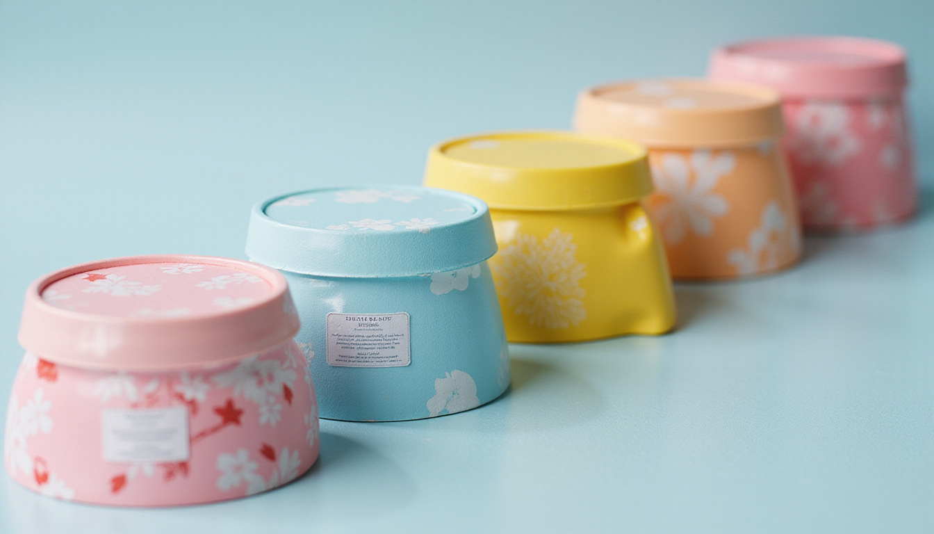
This makes spot colors ideal for logos, corporate colors, and any critical brand elements where even small shifts are unacceptable.
Spot Color vs CMYK: Why It Matters for Brand Consistency
Understanding the difference between spot color printing and CMYK (also called process color) is essential for consistent brand identity.
CMYK (Process Color)
CMYK combines four transparent inks—cyan, magenta, yellow, black—into millions of colors. It’s perfect for:
- Full-color photographs
- Complex illustrations
- Gradients and detailed imagery
However, CMYK has some downsides for brand-critical colors:
- Limited gamut: Some bright oranges, vivid greens, and intense blues are difficult or impossible to hit accurately.
- Variability: Different presses, papers, and settings can shift the final color.
- Metamerism risks: Colors may look different under different lighting conditions.
Spot Color Printing
Spot color printing, by contrast, uses one solid, mixed ink for each color:
- Exact formulas: You pick a Pantone (or other system) swatch, and the printer mixes the ink to that standard.
- Superior consistency: Less dependent on the press profile or subtle changes in ink balance.
- Special effects: Metallics, fluorescents, pastels, and custom brand colors that CMYK can’t mimic well.
For brand colors, a common best practice is:
- Use spot colors for logos and key brand elements
- Use CMYK for photos and supporting imagery
- Or a combination on the same job (e.g., CMYK + 1 or 2 spot colors)
The Power of Pantone and Other Spot Color Systems
The most widely recognized system for spot color printing is the Pantone Matching System (PMS). Pantone provides:
- Swatch books showing how each color looks on coated and uncoated stocks
- Numerical IDs (e.g., Pantone 186 C) so designers and printers reference the same exact color
- Mixing formulas so inks can be reproduced anywhere in the world
Other systems exist (like TOYO or HKS in some regions), but Pantone is the global standard for many brands and agencies.
When you specify a Pantone color:
- Your designer selects the color swatch in a Pantone library.
- The print provider mixes ink according to Pantone’s recipe.
- The press runs that exact ink as a separate “spot” plate.
Pantone also offers Pantone Color Bridge guides, which show the closest CMYK simulation of a spot color. This helps you see how your brand color might look in process printing alone versus spot color printing.
For more detail on spot and process color standards, the Pantone website is a solid reference (source: Pantone).
When You Should Use Spot Color Printing
You don’t need spot colors for every project, but in some situations they’re absolutely worth it.
Best Use Cases for Spot Colors
Use spot color printing when:
- Your brand color is non-negotiable. Corporate identity materials, signage, and packaging where brand recognition is key.
- You need special inks. Metallics (gold, silver), fluorescents, or unique pastels that CMYK cannot reproduce.
- You have limited colors. 1–3 color designs (e.g., stationery, envelopes, forms) can be cheaper and more consistent with spot colors than full CMYK.
- You print across many substrates. Labels, boxes, textiles, and specialty stocks where CMYK may shift more dramatically.
Examples:
- A bank that must maintain the same deep blue on cards, brochures, and signage.
- A cosmetics brand that relies on a signature metallic rose-gold foil accent.
- A craft beer label that hinges on a neon-green logo that CMYK can’t match.
How to Set Up Your Artwork for Spot Color Printing
To get the full benefit of spot color printing, you need to set your files up correctly from the start.
1. Choose the Correct Spot Color Library
In your design software (Adobe Illustrator, InDesign, etc.):
- Load the appropriate Pantone library (e.g., “Pantone Solid Coated” for glossy stock, “Pantone Solid Uncoated” for uncoated).
- Select your brand colors from that library—not from CMYK or RGB sliders.
2. Define Spot Colors (Not Process)
Ensure each brand color is truly a spot color:
- In swatches, the color type should be set to Spot Color, not Process.
- Name the swatch exactly as the Pantone reference (e.g., “PANTONE 300 C”).
This tells the RIP/print system to output a separate plate for that color.
3. Use Spot Colors Consistently
Avoid creating multiple versions of the same color:
- Don’t mix close CMYK equivalents in one place and spot in another.
- Use the same named spot color swatch across all elements and all documents.
4. Communicate With Your Printer
Before finalizing:
- Ask your printer which Pantone book they reference.
- Confirm they will print using spot inks, not convert them to CMYK.
- Request a contract proof or press check for critical jobs.
Early communication saves time, money, and frustration.
Managing Paper, Coatings, and Lighting
Even with perfect spot color printing, other factors influence how your color appears to the human eye.
Paper Stock (Coated vs Uncoated)
A color like Pantone 300 will look:
- Brighter and more saturated on coated paper (e.g., glossy brochures)
- Softer and more muted on uncoated paper (e.g., letterhead, envelopes)
Pantone provides separate “C” (coated) and “U” (uncoated) swatches because of this. Your brand guidelines should specify which variant to use on each substrate.
Coatings and Finishes
Gloss, matte, and soft-touch coatings also impact perception:
- Gloss makes colors appear richer and more vivid.
- Matte can slightly flatten colors but enhance readability.
- Soft-touch changes tactile feel and can subtly reduce contrast.
Discuss finishes with your printer and, if possible, view physical samples before committing.
Lighting Conditions
Colors can shift under different lighting (daylight vs office LEDs vs store halogens). For color-critical evaluation:
- Use standardized lighting if possible (e.g., D50 viewing booths in professional environments).
- Check proofs in the environment where the printed piece will be used (e.g., retail floor, office lobby).
Common Mistakes That Ruin Spot Color Consistency
Avoid these frequent pitfalls when working with spot color printing.
-
Converting to CMYK accidentally
- Exporting PDFs with all colors converted to process.
- Fix: When creating PDFs, ensure you preserve spot colors in export settings.
-
Using RGB or Hex for print
- Choosing colors designed for screens and expecting a perfect print match.
- Fix: Always start with Pantone spot or CMYK for print; use RGB/Hex as the translation for web.
-
Ignoring substrate differences
- Specifying the same Pantone for both glossy covers and uncoated letterheads without adjusting expectations.
- Fix: Use the correct Pantone variant (C vs U) and plan for visible differences.
-
Too many “close” brand colors
- Overcomplicating the palette with multiple similar blues or reds, making color control difficult.
- Fix: Keep a lean, well-documented primary palette with exact spot specifications.
Practical Workflow for Bulletproof Brand Color
Use this simple workflow to lock in reliable results:
- Define brand colors as Pantone spots and document them in your brand style guide.
- Build all print assets using those exact spot swatches.
- Talk with your printer about stock, coatings, and spot vs process from the beginning.
- Request and approve physical proofs for key pieces (e.g., packaging, core brochures).
- Keep your Pantone books up to date and replace them as they fade over time.
FAQs About Spot Color Printing
What is the difference between spot color printing and process color printing?
Spot color printing uses pre-mixed, formula-based inks (like Pantone colors) printed as solid, individual colors. Process color printing uses CMYK to build colors from a combination of four inks. Spot colors deliver higher consistency and allow for special inks; process colors are better for full-color photos and complex imagery.
When should I use Pantone spot colors instead of CMYK?
Use Pantone spot colors when your brand color needs to be exact and repeatable, when you need metallic or fluorescent effects, or when your design uses only one to three colors. Use CMYK for photo-heavy pieces or when budget and flexibility take priority over absolute color precision.
Can I combine CMYK and spot color printing in the same job?
Yes. Many professional print jobs use CMYK plus one or more spot colors. For example, a brochure might print photos in CMYK and the logo in a Pantone spot color to guarantee brand accuracy. This hybrid approach balances visual richness with consistent branding.
Consistent, vibrant brand color isn’t an accident—it’s the result of designing and printing with intention. By embracing spot color printing where it matters most, specifying Pantone (or similar) standards, and collaborating closely with your print provider, you can eliminate guesswork and protect the visual integrity of your brand across every touchpoint.
If you’re ready to bring your brand colors under control, start by auditing your current print materials and identifying where color is drifting. Then partner with a knowledgeable print provider who can help you translate your brand palette into a smart mix of spot and process printing. Take that step now, and your next round of printed materials won’t just look better—they’ll finally look unmistakably, consistently like your brand.