Effective brochure design is still one of the most powerful ways to present your brand, explain your offer, and convert curious prospects into paying customers. Even in a digital-first world, a well-crafted brochure can communicate depth, build trust, and support sales conversations in ways a single web page often can’t.
This guide walks through practical brochure design strategies—from layout and copy to branding and printing—so you can create brochures that look polished, feel professional, and actually drive action.
Why Brochures Still Matter in a Digital World
Brochures bridge the gap between physical and digital marketing:
- They give prospects something tangible to hold and review.
- They’re perfect for events, trade shows, showrooms, and direct mail.
- They can summarize complex offers in a clear, structured format.
- They often have a longer “desk life” than a social media post or ad.
When you apply intentional brochure design principles, your piece becomes more than a handout—it becomes a focused sales tool aligned with your brand.
Start With Strategy: Define Purpose, Audience, and Action
Before you open any design software, clarify what your brochure is supposed to do. Good brochure design is 80% strategy, 20% decoration.
1. Define the Primary Goal
Choose one clear goal for your brochure, such as:
- Generate inquiries or demo requests
- Promote a specific service or product line
- Educate and nurture leads (e.g., at a trade show)
- Provide take-home details after a meeting
Your goal will influence the format, content depth, and call to action.
2. Know Your Audience
Your brochure should feel like it was made specifically for the reader. Define:
- Who will receive it (e.g., homeowners, B2B buyers, parents, donors)
- Their pain points and questions
- Their decision stage (awareness, consideration, or ready to buy)
This affects everything from headline wording to the imagery you choose.
3. Choose One Primary Call to Action (CTA)
Every strong brochure design drives toward a next step:
- “Book a free consultation”
- “Call us for a quote”
- “Visit our showroom”
- “Scan this QR code to see pricing”
You can mention secondary CTAs (e.g., “Follow us on social media”), but keep one main action front and center.
Choose the Right Brochure Format and Fold
Your format should support your content—not the other way around.
Common Brochure Types
- Bi-fold (half-fold): Simple, clean, ideal for straightforward offers or menus.
- Tri-fold: Most popular; offers six panels for a logical narrative.
- Z-fold: Panels open separately; good for step-by-step journeys or timelines.
- Gate fold: Dramatic reveal; ideal for launch campaigns or hero products.
- Booklet / multi-page: Best for detailed catalogs or complex services.
When planning your brochure design, sketch a quick content map on paper. Decide what appears on:
- Front cover (hook + brand)
- Back cover (contact + CTA)
- Interior panels (benefits, details, proof, offer)
This avoids cramped layouts and ensures each panel has a clear job.
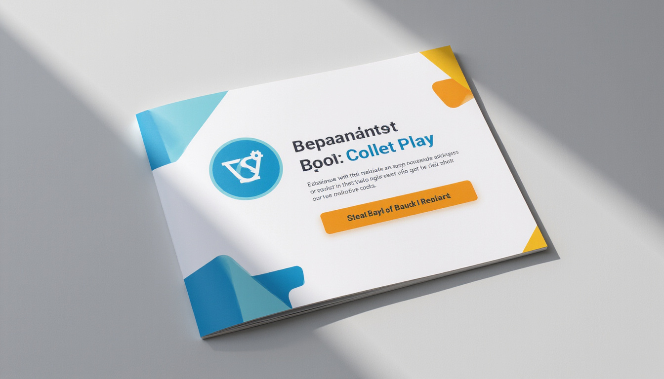
Front Cover: Hook, Brand, and Clarity in One Glance
Your cover determines whether anyone opens the brochure. It must attract attention and make the purpose obvious.
Elements of a Strong Brochure Cover
- Clear headline focused on the reader’s outcome (e.g., “Cut Your Energy Bills by 30%”)
- Subheading that clarifies the offer or audience
- Clean brand presence: logo, brand colors, and possibly tagline
- Compelling hero image or illustration that supports the message
- Minimal clutter: avoid stuffing the cover with text and offers
Ask: “Could a stranger tell who this is for and what it’s about in two seconds?” If not, simplify.
Layout That Guides the Eye and Boosts Readability
Good brochure design uses hierarchy and structure to guide readers through your message.
Use Visual Hierarchy
- Make headlines clearly larger than body text.
- Use sub-headings to break up sections.
- Highlight key points with bold text or pull quotes.
- Use consistent spacing between sections.
Embrace White Space
Crowded brochures feel cheap and overwhelming. White space:
- Improves readability
- Makes your brand feel more premium
- Helps important elements stand out
Resist the urge to fill every gap with text or graphics.
Grid-Based Layout
Design within a grid (often 3 or 4 columns):
- Align text boxes, images, and icons.
- Maintain equal margins and gutters.
- Keep recurring elements in the same positions on each panel (e.g., headlines, icons).
Consistent alignment creates a professional, high-end impression.
On-Brand Visuals: Colors, Fonts, and Images
Your brochure should look like a natural extension of your website and other marketing—recognizable at a glance.
Color Palette
- Start with your brand colors, then add 1–2 neutrals (white, light gray, or dark gray).
- Use one accent color for CTAs and key highlights.
- Maintain strong contrast between text and background for readability.
Check your color contrast with an accessibility tool to ensure legibility (source: W3C Web Accessibility Initiative).
Typography
Limit yourself to 2, at most 3, typefaces:
- A headline font (can be more expressive but still legible)
- A body font that’s simple and clean (sans-serif is a safe choice for print)
- Optional: a display or accent font for small highlights
Maintain consistent font sizes and styles for:
- Titles and headings
- Sub-headings
- Body copy
- Captions and footnotes
Imagery and Iconography
- Use high-resolution images (300 dpi for print).
- Choose photos that show real people, real contexts, or real results.
- Avoid generic, overused stock photos that weaken trust.
- Use icons sparingly to clarify benefits or features, not just for decoration.
- Maintain a consistent visual style across all images.
Write Copy That Sells: From Features to Benefits
Brochure design is not just about visuals; copy is what persuades. Many brochures fail because they list features without connecting them to outcomes.
Focus on the Reader, Not the Company
Instead of “We are a leading provider of…,” write:
- “Get faster response times and lower costs with…”
- “Save hours each week by…”
Use “you” and “your” more than “we” and “our.”
Structure Your Message
A simple and effective structure for your interior panels:
- Problem or desire: What your audience cares about.
- Promise: The outcome you deliver.
- Proof: Testimonials, stats, case studies, certifications.
- Details: Features, services, process steps.
- Offer and CTA: What they should do next.
Make It Scannable
People skim brochures first, then read what catches their interest. Help them by:
- Using short paragraphs and bullet points.
- Highlighting key numbers or phrases.
- Adding call-out boxes for important benefits.
Include Social Proof and Trust Signals
High-converting brochure design builds credibility fast.
Consider adding:
- Short testimonials with names and roles
- Before-and-after metrics or results (e.g., “Increased leads by 42%”)
- Logos of well-known clients or partners
- Certifications, awards, or memberships
- Guarantees (money-back, warranty, etc.)
Place social proof near your CTA or next to key claims to reinforce them.
Design Your Call to Action for Conversion
Your brochure’s success is measured by how many readers take the next step, not how pretty it looks.
Make the CTA Specific and Visible
- Use action verbs: “Call,” “Book,” “Visit,” “Download.”
- Add urgency where appropriate: “Limited to 25 spots,” “Offer ends June 30.”
- Use a contrasting color for buttons, boxes, or highlighted text.
- Place the primary CTA in at least two locations (e.g., inside panel + back cover).
Offer One Clear Path
If you give too many options—call, email, visit, fill a form, follow, chat—people delay. Pick the one path that best supports your sales process, then list others less prominently.
Practical Checklist for Effective Brochure Design
Use this quick checklist before sending your brochure to print or sharing a digital PDF:
-
Goal & Audience
- Clear primary purpose?
- Specific audience defined?
-
Content & Structure
- Strong, benefit-driven headline on the cover?
- Logical flow from problem → solution → proof → CTA?
- Minimal jargon and clear language?
-
Branding & Visuals
- Consistent colors, fonts, and image style?
- High-quality, relevant photos or graphics?
- Plenty of white space and consistent margins?
-
Readability
- Font sizes comfortable for print (at least 10–11 pt body text)?
- Good contrast between text and background?
- Copy broken into short sections with sub-headings and bullets?
-
Conversion
- One primary CTA, clearly highlighted?
- Contact details easy to find on the back cover?
- QR code or link to track digital actions, if needed?
-
Technical
- Correct bleed, margins, and trim marks for your printer?
- Images at 300 dpi and in CMYK color mode?
- Proofread multiple times for typos and inconsistencies?
Print and Paper Choices That Elevate Your Brochure
Production decisions can dramatically affect how your brochure design is perceived.
Paper Stock
- Heavier stock (e.g., 200–300 gsm) feels more premium and durable.
- Matte finish: Softer, more sophisticated; easier to read.
- Gloss finish: Vivid colors and photos; can show fingerprints.
Choose a paper that aligns with your brand. A luxury brand may favor thick, matte stock; a tech company might choose a sleek, semi-gloss finish.
Special Finishes (Optional but Impactful)
If budget allows, consider:
- Spot UV (shiny highlight on logos or headlines)
- Foil stamping (metallic accents)
- Embossing/debossing (raised or recessed elements)
- Die-cut shapes (unique edges or windows)
Use these sparingly—tasteful accents add perceived value; overuse can feel gimmicky.
Don’t Forget the Digital Version
Even if your primary use is physical, ensure your brochure design translates well to digital:
- Export a web-optimized PDF for easy emailing and downloads.
- Test readability on screens, especially mobile.
- Make links and QR codes clickable in the digital version.
- Host the brochure on a dedicated landing page to capture leads.
A cohesive print-and-digital approach maximizes the value of your brochure content and design work.
FAQ: brochure design and Best Practices
1. What makes a brochure design “high-converting”?
A high-converting brochure is strategically built around one goal and one primary CTA. It uses clear, benefit-focused copy, strong visual hierarchy, social proof, and on-brand design to guide readers toward a specific action—such as calling, booking, or visiting a website.
2. How do I keep my brochure graphic design consistent with my brand?
Use the same core elements you use elsewhere: brand color palette, typography, logo rules, and photography style. Create or follow a brand style guide and apply it rigorously to layout, imagery, and tone so your brochure feels like part of a cohesive system.
3. Is digital or printed brochure design more effective?
Both can be highly effective, but in different contexts. Printed brochures work well at events, in physical locations, and as leave-behinds after meetings. Digital brochures (PDFs, interactive versions) are ideal for email follow-ups and website downloads. The strongest strategy is often to create a design that works in print and optimize a version for digital distribution.
A well-planned brochure can become one of your most reliable sales tools—something your team is proud to hand out and your prospects actually keep. If you’re ready to turn your ideas into a high-converting, on-brand brochure, start by outlining your goal, audience, and key message, then apply the design principles in this guide.
Need help bringing it all together? Consider partnering with a professional designer or marketing team who can translate your brand into a brochure that not only looks polished but also drives real results. Your next great client might be just one brochure away from saying “yes.”