Whether you’re promoting an event, launching a product, or decorating a space, mastering poster printing can dramatically improve how your message is seen and remembered. Done right, a poster doesn’t just look good—it stops people in their tracks, communicates clearly at a glance, and compels them to act.
This guide breaks down the essential poster printing secrets that designers, marketers, and print shops rely on to create consistently stunning display posters.
1. Start with a Clear Purpose and Audience
Before thinking about paper, finishes, or special effects, define two things:
-
What is the poster’s goal?
- Sell tickets?
- Build brand awareness?
- Educate or inform?
- Decorate or inspire?
-
Who is the audience?
- Age, interests, and visual preferences
- Where they’ll see the poster (street, store, school, office, trade show)
- How far away they’ll be when viewing it
Your answers will drive all major poster printing decisions: size, layout, fonts, colors, and materials.
Tip: Sum up your poster’s purpose in one sentence:
“After seeing this poster, I want people to __________.”
Design everything to support that action.
2. Choose the Right Poster Size and Orientation
Size isn’t just a technical choice—it’s a visibility and impact decision.
Common poster sizes
- Small (A3, 11" x 17")
Great for indoor notice boards, cafes, and flyers you can hand out. - Medium (A2, 16" x 24", 18" x 24")
Ideal for events, store windows, and indoor displays. - Large (A1, 24" x 36")
Good for outdoor posters, busy corridors, or attention-grabbing campaigns. - Extra-large (A0, 27" x 40" and up)
Used for large-format advertising, trade shows, or big indoor walls.
Portrait vs. landscape
- Portrait (vertical) is standard for most event and advertising posters; easier for storefronts and notice boards.
- Landscape (horizontal) can be more dramatic and works well in wide spaces, behind counters, or above stages.
Match the size and orientation to where the poster will live—ask your printer for templates to avoid costly resizing later.
3. Design Fundamentals: Layout, Hierarchy, and White Space
A stunning design doesn’t need to be complex. It needs to be clear.
Visual hierarchy: guide the eye
Every great poster printing job starts with a strong hierarchy:
- Primary element – What people should see first (headline, main image, or product).
- Secondary information – Supporting details (dates, offer, subheading).
- Tertiary details – Fine print, website, social handles, QR codes.
Use size, contrast, and placement to control this hierarchy. Your key message should be readable from a distance; supporting info can be smaller.
Balance and alignment
- Use a simple grid to place elements consistently.
- Align text and images to create order and cleanliness.
- Avoid clutter; every extra element competes for attention.
White space is your friend
White space (empty areas) helps important elements stand out and makes your poster feel premium and modern. Don’t be afraid of “empty” areas—busy designs often get ignored.
4. Typography that Works From Across the Room
Poor type choices are one of the fastest ways to ruin otherwise good poster printing.
Choose legible fonts
- Stick to 1–2 typefaces (e.g., one for headings, one for body text).
- Avoid overly decorative fonts for main copy; use them sparingly in headlines if they remain readable.
- Sans-serif fonts (e.g., Helvetica, Montserrat, Futura) are often easier to read from afar.
Make it readable at a distance
Here’s a simple rule of thumb:
- Viewers need about 1 inch of letter height for every 10 feet of viewing distance (source: signage legibility guidance from the United States Sign Council Foundation: https://usscfoundation.org).
- 10 ft away → ~1" letters
- 50 ft away → ~5" letters
Ask yourself: “Can someone walking past at normal speed understand the main message in 3 seconds?”
Maintain contrast
High contrast between text and background is essential:
- Dark text on a light background or vice versa.
- Avoid putting thin text over busy photos—use overlays or solid blocks behind text.
5. Color Choices That Pop in Print
What looks good on screen does not always translate directly to poster printing.
Understand CMYK vs. RGB
- Screens use RGB (Red, Green, Blue) colors.
- Printers use CMYK (Cyan, Magenta, Yellow, Black) inks.
Design your poster in CMYK color mode whenever possible, or at least soft-proof it to approximate printed colors. Expect some shift from what you see on your monitor.
Use color with intention
- Use brand colors where relevant to maintain consistency.
- Limit your palette to 2–4 main colors to avoid visual noise.
- Use bold accent colors to highlight calls to action, dates, or offers.
Be careful with dark backgrounds
Dark or black-heavy designs can look amazing, but:
- They show fingerprints and scratches more easily.
- They may require more ink coverage and higher-quality stock to avoid banding or muddy blacks.
If you use large dark areas, consider premium paper and higher print resolution.
6. Images, Graphics, and Resolution: No More Blurry Prints
Great poster printing demands high-quality visuals. Low-res images will betray you the moment the poster is enlarged.
Minimum resolution guidelines
- Use 300 dpi (dots per inch) at final print size for photos and graphics.
- For very large posters viewed from a distance, 150–200 dpi can sometimes work, but always verify with your printer.
Vector vs. raster
- Vector graphics (logos, icons, illustrations in formats like .AI, .EPS, .SVG, or vector PDF) can be scaled infinitely without losing quality – ideal for logos and shapes.
- Raster images (photos in JPG, PNG, TIFF) will pixelate if upscaled too far.
Whenever possible, use vector files for logos and type, and high-resolution photos for imagery.
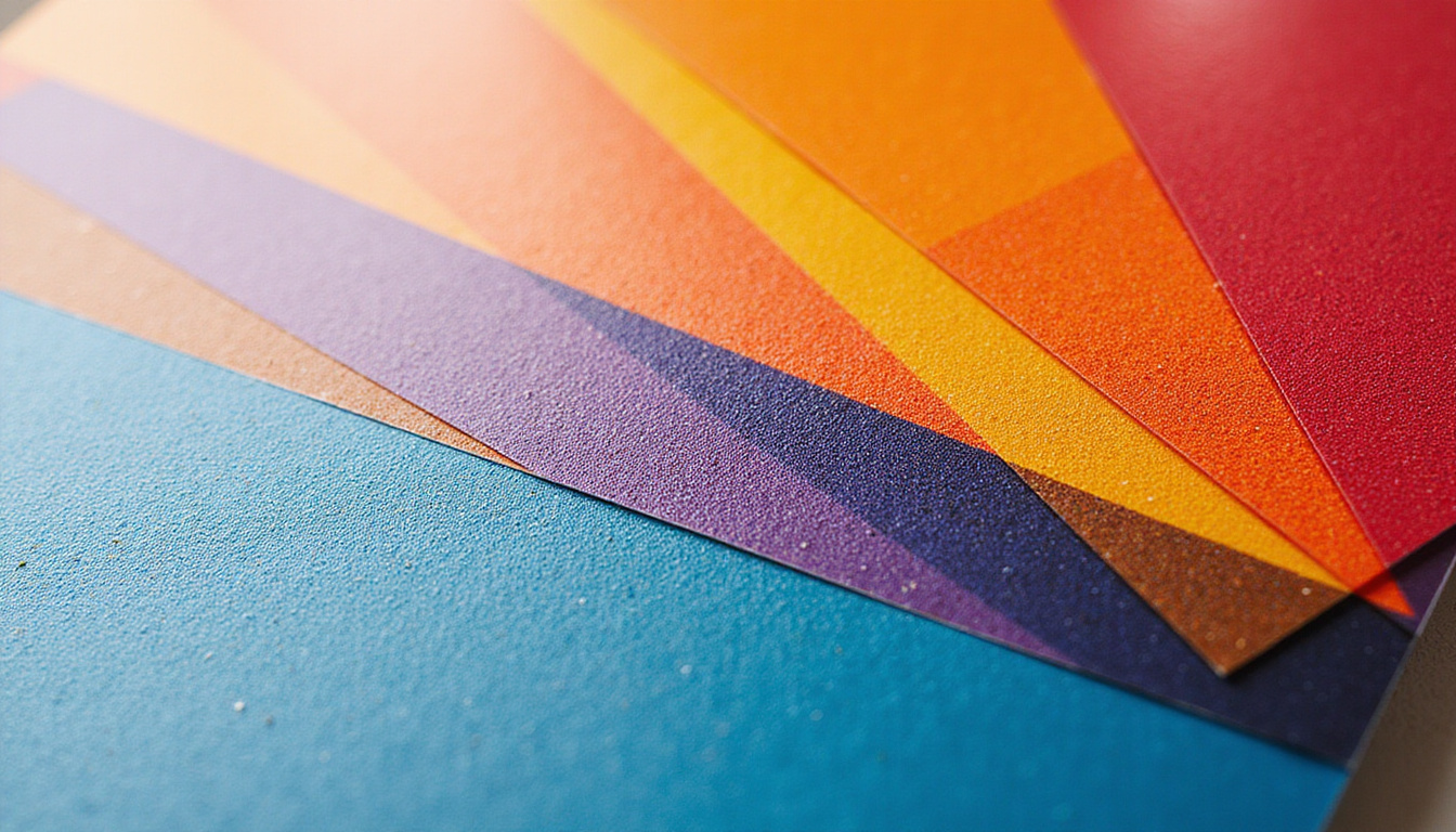
Image selection tips
- Use one strong hero image rather than many small ones.
- Avoid generic stock photos; choose images with clear subject matter and strong contrast.
- Ensure you have rights to print the imagery at the needed size and quantity.
7. Paper Stock, Finishes, and Durability
The physical feel of your poster is just as important as the design. Different poster printing stocks and finishes significantly affect appearance and lifespan.
Paper weight (thickness)
- Lightweight (100–150 gsm) – economical, good for short-term indoor use or mass distribution.
- Medium (170–200 gsm) – popular for quality indoor posters.
- Heavy (220–300+ gsm) – more rigid, premium feel, better durability.
Coating and finishes
-
Matte
- Soft, elegant, less glare.
- Great for readability under bright lights.
- Good for posters that may be written on (e.g., schedules, checklists).
-
Gloss
- Vibrant, high-contrast, colors “pop.”
- Can show fingerprints and glare under strong lighting.
-
Satin / Silk
- A middle ground between matte and gloss.
- Often ideal for professional displays and retail environments.
For outdoor posters, ask about weather-resistant or synthetic stocks, or combine standard paper with protective display frames.
8. Special Effects That Elevate Your Poster
Once you’ve mastered the basics, certain print enhancements can turn a good poster into a premium showpiece.
Consider these options (availability varies by printer):
- Lamination (matte or gloss) – adds durability and a professional finish.
- Spot UV – glossy highlights on selected areas like logos or headlines.
- Foil stamping – metallic accents that shimmer under light.
- Embossing/debossing – raised or pressed-in elements; more common on smaller prints but can be used on premium posters.
Use these sparingly and strategically—too many effects can feel gimmicky and increase costs.
9. Preparing Print-Ready Files: Technical Checklist
Many poster printing headaches come from files that aren’t correctly prepared. Before sending art to your print shop, run through this checklist:
1. Correct size and bleed
- Set your document to the exact final size.
- Add bleed (commonly 0.125" / 3 mm on all sides) so colors or images can print to the edge and be trimmed cleanly.
- Keep important content inside safe margins (at least 0.25" / 6 mm from edges).
2. High resolution and proper color
- All photos/graphics at 300 dpi at print size.
- Colors converted to CMYK, or verify with your printer if they accept RGB.
- Avoid relying on super-bright neons—standard CMYK can’t reproduce true fluorescent colors.
3. Embed or outline fonts
- Either embed fonts in your PDF or convert text to outlines/curves to avoid font substitution issues.
4. Export as print-ready PDF
- Use your printer’s PDF preset or specification if they provide one.
- Include bleeds and crop marks when required.
A 5-minute preflight check can save days of back-and-forth and prevent costly reprints.
10. Choosing a Poster Printing Partner
If you’re not printing in-house, the right print partner can elevate your project.
Look for:
- Experience with large-format printing and posters similar to yours.
- Paper and finish samples you can touch and compare.
- Color management capabilities, like calibrated presses and proofing.
- Clear communication about timelines, file requirements, and pricing.
Ask for a test proof (digital soft proof or physical hard proof) before committing to a large run, especially for color-critical or high-value projects.
11. A Simple Poster Creation Workflow
To tie it all together, here’s a streamlined process you can follow:
- Define purpose and audience – Clarify goals and context.
- Pick size and orientation – Based on where it will be displayed.
- Sketch a layout – Decide hierarchy: headline, image, key info, CTA.
- Choose fonts and colors – Limit your palette and font choices.
- Source images/graphics – High resolution, on-brand, legally licensed.
- Design in CMYK with bleed – Use a design tool like InDesign, Illustrator, Affinity, or similar.
- Preflight your file – Resolution, size, bleed, margins, fonts, color mode.
- Proof and adjust – Get feedback, test legibility at distance, tweak.
- Send to printer – Provide a print-ready PDF and confirm specs.
- Inspect the final prints – Check color, sharpness, and trimming accuracy.
FAQ: Common Questions About Poster Printing
Q1: What file format is best for professional poster printing?
For most professional printers, a high-resolution PDF with bleed, crop marks, and embedded fonts is ideal. Some shops also accept TIFF or EPS, but PDF is the standard for preserving layout, fonts, and vector elements.
Q2: What resolution do I need for large format poster print?
Aim for 300 dpi at final size wherever possible. For very large posters viewed from several meters away, 150–200 dpi can be acceptable, but you should always confirm requirements with your print provider.
Q3: How do I make colors accurate when printing posters?
Design and export in CMYK, use a calibrated monitor if possible, and request a printed proof from your poster printing company. Avoid extreme neon shades and very dark gradients, which may not reproduce faithfully in standard CMYK.
Turn Your Next Poster into a Showstopper
You don’t need to be a full-time designer to create display posters that look professional and perform brilliantly. By clarifying your goals, designing for legibility and impact, choosing quality materials, and preparing your files correctly, you unlock the real potential of poster printing.
If you’re ready to turn your ideas into eye-catching visuals, start planning your next poster today: define the message, sketch the layout, gather your assets, and reach out to a trusted print partner for samples and guidance. With the right approach, your next poster won’t just fill a space on the wall—it will attract attention, communicate clearly, and move people to action.